Done. The crib will be centered on this wall. The giraffes are the most dominant element of the design, so I placed them so they fell straight down the center of the wall.
The wall was originally textured . And at the bottom you can see where some screws for shelf mounting brackets were removed and then patched over. This texture doesn’t look good under wallpaper , plus it interferes with good adhesion .
So I’m using a trowel to skim-float the wall with joint compound . Once it’s dry (overnight), I’ll sand it smooth .
I use this Plus 3 joint compound by USG Sheetrock . It sticks well, doesn’t shrink or crack , accepts the primer nicely, and is easier to sand than the All Purpose type by the same brand.
After sanding and vacuuming, I wipe off all residual dust with a damp sponge. Once the wall dries again, I like this Gardz as a primer . It’s thin and soaks into the porous joint compound, dries hard, and binds the surfaces together. It also provides a good surface to hang wallpaper on. Dries quickly, too, especially with a heavy-duty floor fan blowing on it. The fabric collars are around the can to catch drips .
Giraffe
Elephant , zebra
Impala . Looks like a water color painting .
The pattern is called On The Savannah and is by York , in their Sure Strip line. I like this product a lot. It’s pre-pasted, which means there is adhesive already on the back, so all you have to do is wet it to activate the paste . They tell you to use a squirt bottle . But that’s too uneven coverage for me, and too much strain on the wrist . I prefer to drip on some water from a bucket with a sponge , and then spread it around with a paint roller . I also add a little augmentary paste to the mix . Also, this paper strips off the wall easily when you redecorate . The wallpaper was purchased below retail price from Dorota at the Sherwin-Williams in the Rice Village area of Houston . She’s got over 300 selection books – and knows what’s in every one of them, so can help you quickly find your perfect pattern . Hours vary, so call first, and make an appointment. (713) 529-6515 installer
This couple in a nicely updated 1939 home in the Montrose neighborhood of Houston has a blank wall in the back of their large walk-in closet. They have a lot of colorful , modern art and wanted a backdrop for it that would be fun, but wouldn’t compete .One of the gals is an administrator for the athletic department in a local school district – so this small print “ Swimmers “ design is just perfect. In fact, the day I hung this, she was away at a swim meet in Austin ! Note that Spoonflower offers scores of designs under the “ Swimmers “ name, so be sure to check all of them, and all the colorways they come in, too. Detail Spoonflower is a little different from most wallpaper companies, in that it’s material comes in individual panels, or sheets – which they call rolls . Each of these is 24” wide, and then you choose the length you want, between 3’, 6’, 9’, and 12’. Each roll comes nicely packaged in an individual thick plastic zip-lock bag . These ones are upside down, so I had to re-roll them so the pattern would be coming off the top of the roll . Here are some tips about hanging Spoonflower. First of all, I like their “ Pre-Pasted Smooth Removable “ option. And it’s the only one I’ll work with. Their “ Traditional Pebble “ is a heavy vinyl that requires special trimming , bubbles, and is better suited for commercial spaces. And, the Peel & Stick – well, everyone ought to forget that sad stuff. Please read my link to the right about that material. In this photo, you can see that the white material is thin and translucent , allowing things underneath to show through, sort of like a shadow . So I need to be careful to make my pencil marks and notes on the wall very lightly. Side note: Never write on the wall or paper with ink or marker or crayon or grease pencil – it will bleed through the wallpaper . This is a pre-pasted material , meaning that a thin layer of paste is already applied to the back. To activate the paste , all you need to do is dip it in water , run it through a water tray , or spritz the back with a squirt bottle (uneven and kills your wrist) . Their paste is quite adequate. But I do like to have a little extra assurance, so I will roll on a little of my Roman 780 wallpaper paste onto the back. Then I take a sponge and drip clean water from a bucket onto the back of the paper . Next I use a paint roller to spread the mixture of water and paste around the back . This both activates the pre-paste, and also spreads around a little extra adhesive . Next, the paper gets folded pasted-side-to-pasted-side ( called booking ), then rolled or folded loosely. I like to dip the ends of the rolled strip into a bucket of water – just 1/8” or so, to prevent them from drying out while booking. Then the strip is placed in a plastic trash bag to prevent it from drying out during the booking period – a few minutes. I use this time to paste and book my next strip . Spoonflower Pre-Pasted Smooth is a little different from most papers, because it’s designed to be overlapped at the seams. Here I am lining up a seam. This overlap does show as a ½” wide ridge along the entire length of each strip. With busy patterns, it’s not very visible. Even with sparse designs like this one, once it’s dry and flat, you don’t notice. Here’s the overlapped seam looking toward the light, which is leaving a very minor shadow. And the overlap can be a good thing. For starters, most wallpapers shrink a little when the paste dries, so you can end up with slight gaps at the seams. Overlapping eliminates that. Also, if a wall is unstable underneath, due to incompatible layers of paint , or dusty walls, or other, the tension of these drying strips of paper can cause the layers inside the wall to come apart / delaminate – and that will result in paper that comes away from the wall, taking layers of paint and etc. along with them. This usually cannot be repaired or “ glued back down .” (Do a Search here to learn more) So overlapping the seams disperses the tension caused by the drying paper, and eliminates any seam from landing on the wall (because the sheets are overlapped ), so no popped seams .Here is the seam looking away from the light.Because Spoonflower Smooth Pre Pasted is thin paper and water-activated , it absorbs a lot of moisture from the water. So the material can’t help but expand . This can result in bubbles on the wall. Also, when air pockets develop, there is nowhere for the air to escape, so, again, bubbles and blisters. If there are huge bubbles, it may be worth taking a brush or plastic smoother and chasing them out. Or using a pin or razor blade to poke tiny holes to let the air out. But, really, if you can just relax and let nature take its course, as the paper dries, these bubbles will dry flat and disappear. Trust me. Another thing that can happen is wrinkles . These tend to form in the same place on every strip , and coordinate with how the paper was booked and rolled after pasting . The worst of these can be chased out with a plastic smoother. But there are dangers to over-using the smoother tools. Doing so can stretch the wallpaper and cause it to warp, which means the pattern might not match up perfectly on the next strip. Or it might cause wrinkles that can’t be brushed out. Again – if you can just sit tight and let the paper dry naturally, the creases and folds will disappear. I did some experimenting and found that booking and then rolling the strip up like a newspaper resulted in more wrinkles.It worked better to paste, book, and then fold gently and loosely. Then into the plastic bag to sit for a few minutes . Spoonflower PrePasted Removeable Smooth . I like this stuff. Removeable means that it’s designed to strip off the wall easily and with no/minimal damage to your wall when you redecorate down the road. I suspect this is made by York , as it’s very similar to their SureStrip line . Good stuff. The order comes with a mock-up of the strips / rolls you’ve purchased.Install instructionsPromo info from Spoonflower .
Pre-pasted papers come with a thin layer of adhesive on the back. In the old days, we ran the paper through a water tray or trough to activate the paste. I’ll still do that sometimes these days, and also roll a very thin layer of paste onto the wall before hanging the strip. Alternately, current instructions suggest using a squirt bottle to mist the back side of the paper, wetting enough to activate the paste. That sounds like a whole lot of squeezing and pain in the wrist / hands to me! Additionally, I don’t believe that it will give even coverage of the water. Instead, I’ll take a small amount of paste from my bucket and roll a very light coat onto the back of the paper. The paste isn’t really needed, but I like the extra assurance. It’s important that the manufacturer’s adhesive be wetted sufficiently and become activated, so next I’ll take sponge and used it to drip on clean water from a 1-gallon bucket I have sitting on the edge of my pasting table. I sprinkle the water over the back side of the wallpaper, then use my paste roller to gently spread the water over the surface. This activates the paste, and also allows for the substrate to absorb moisture and fully wet-out . Then the paper is booked (folded pasted-side-to-pasted-side) and set in a plastic trash bag for a few minutes, to allow the paste to become activated and for the paper to expand. If you don’t wait the right amount of time, you will end up with paper expanding on the wall – and that means bubbles and blisters. To speed the install process, you can paste your next strip while the first one is booking in the trash bag.
I carry 5-gallon buckets of wallpaper paste in my van. But to make it easy for DIY’ers, rebelwalls.com includes a box of paste with every order. This is powdered paste that needs to be mixed with water. This may be lightweight and easy to ship, but I don’t like to use it when hanging a non-woven material like theirs. Non-wovens are prone to staining and blushing (look like they’re wet but never dry out) . Most often this is caused by the paste – usually a paste that is too “wet” or, in other words, has a high moisture content. Roman 880 is notorious for this, as is Dynomite (now Roman) 234. But a paste that you make by mixing powder into water seems even more risky for having a high water content, and causing staining. And so is the practice of dampening the back of the paper with a damp sponge, or a spritz of water from a squirt bottle. In my mind, too much water / moisture = risk of staining or blushing. I say, skip the anxiety and use a low-moisture pre-mixed vinyl adhesive such as Roman 838 or Dynomite 780 (also now made by Roman). Clay pastes are also known for low water content – but I definitely do not recommend on a non-woven material, as I’ve seen the red clay bleed through far too many wallpaper surfaces.
Everything else in this newish townhome in the far northwest area of Houston is generic beige. But the homeowner envisioned something much more bold and fun for the large powder room.The slope at the top left is the area under the stairs.Close-up. At the far right you can see a seam … the paper was slightly shaded darker on the left edge and lighter on the right edge, resulting in this. It looks like the seam is curled up, but actually it’s perfectly flat. The pattern is called Marigold and it’s sold by Anthropologie. The manufacturer is York, and it’s in their SureStrip line, which is one of my favorites. This is a pre-pasted material, and you activate the paste by wetting the back. The instructions suggest using a squirt bottle – ouch! Can you say wrist pain?! I sprinkle water on with a sponge and then roll it around with a paint roller. I also add a little extra wallpaper paste to the mix.
This wallpaper is by Anderson Prints. It was more than a little difficult to work with. I hung it in two different colorways, and both were equally cantankerous.
~ Top photo – see the streak of darker color at the tip of my scissors? This defect ruined a 9′ strip of paper.
~ Second photo – look at the left edge of the toilet, from that corner up to the ceiling … see the darker color? Every strip showed a little darker color at the edges. Close up, you don’t notice it, but from a distance, there is a vertical line that catches your eye. This is on every seam, in both colorways. So, from a distance, you see this faint but noticeable vertical line every 27″, all across the room.
~ The substrate sucks up paste, enough so that after pasting and booking for a few minutes, by the time I got it to the wall, there was virtually no paste left to hold it up, and absolutely no paste on the edges. I tried several tricks – rolling paste under the seams, spritzing the edges with water, dipping the edges of the booked strips into water to keep them hydrated, unbooking and repasting, unbooking and spraying the back lightly with water to reactivate the paste, and finally, the best option was to paste the back as normal, but use a squirt bottle to add a bit of water, and then cut the booking time a little.
~ No matter which pasting technique was used, particularly on the tan colorway, in some areas where the ink crossed the seam, the paper wanted to curl back and leave a tiny gap.
~ The pattern matched in most areas, but dropped a little in some of the motifs, resulting in a mis-match. Then it would match up perfectly again as you went further down the wall.
~ The paper, particularly the silver colorway, twisted and warped horribly. I would butt a strip up against the previous strip, matching the pattern, then go to smooth the rest of the strip against the wall – only to find HUGE puckers and warps. OK, you can tease away minor wrinkles. But when you have several warped areas that are each protruding 1/2″ away from the wall, it’s really difficult to get that strip of paper to lie flat against the wall. I spent at least 20 minutes working and easing the puckers out of one strip and getting the paper to lie flat. To be honest, I’m astonished that I was able to do that. This particular wall had only three 7′ high strips … Because the warping increases as you hang subsequent strips, if I had had to hang many strips in a row, and taller strips, such as on a bedroom accent wall, I don’t think it could have been done without making some relief cuts or double cuts and resulting in some serious pattern mis-matching.
~ The tan colorway was reasonably durable, plus minor creases would pretty much disappear when the paste dried and the paper pulled flat to the wall. But the silver colorway was very delicate, and was prone to creasing at the drop of a hat. Don’t fold it, don’t wet-trim it, unbooking a pasted strip was very likely to cause a crease, and ditto when pressing the paper into a corner to trim … and working around that toilet was the prime area to put stress on the paper and cause more creases. This toilet was butted up against the wall, so it was impossible to slip the paper behind it, so it was necessary to cut the paper to fit around it. That’s hard enough to do with an electrical outlet that protrudes a half an inch from the wall, but veeery difficult when you have something as three-dimensional as a toilet. I must have spent the better part of an hour working the paper around and behind and under that toilet. Note to Self: Next time, make the homeowner pull the toilet out of the room!
~ The silver colorway had a metallic sheen, and every way the light hit it made the pattern look different. It was literally impossible to see the pattern match in some instances, particularly when turning a corner. What looked like a tan line on the right wall would literally show up as a silver line on the left wall. Look at all the horizontal and vertical lines in this design… It was virtually impossible to tell if I had the right line matching up with its proper partner. Trimming on the table (such as when I needed to split a strip) was equally difficult. I was just about impossible to tell design from shadow, and to know if I was cutting straight along the pattern.
~ Metal left marks on the paper. So I had to be very careful while using my straightedge, as well as other tools such as scissors, trim guide, etc.
~ The paper wouldn’t slide around on the wall as most do, so it was difficult to get each strip perfectly positioned.
~ It ate razor blades like crazy. The paper somehow dulled blades faster than even heavy vinyls.
~ When I cut a strip off the bolt, it wanted to stay rolled up. This made it very difficult to trim or paste the strip. So I had to roll all the strips backwards, until the paper relaxed and got rid of the “memory” to curl.
Most of these issues have to do with the substrate used by the manufacturer, but toss in the metallic ink and whatever engineer screwed up the pattern match.
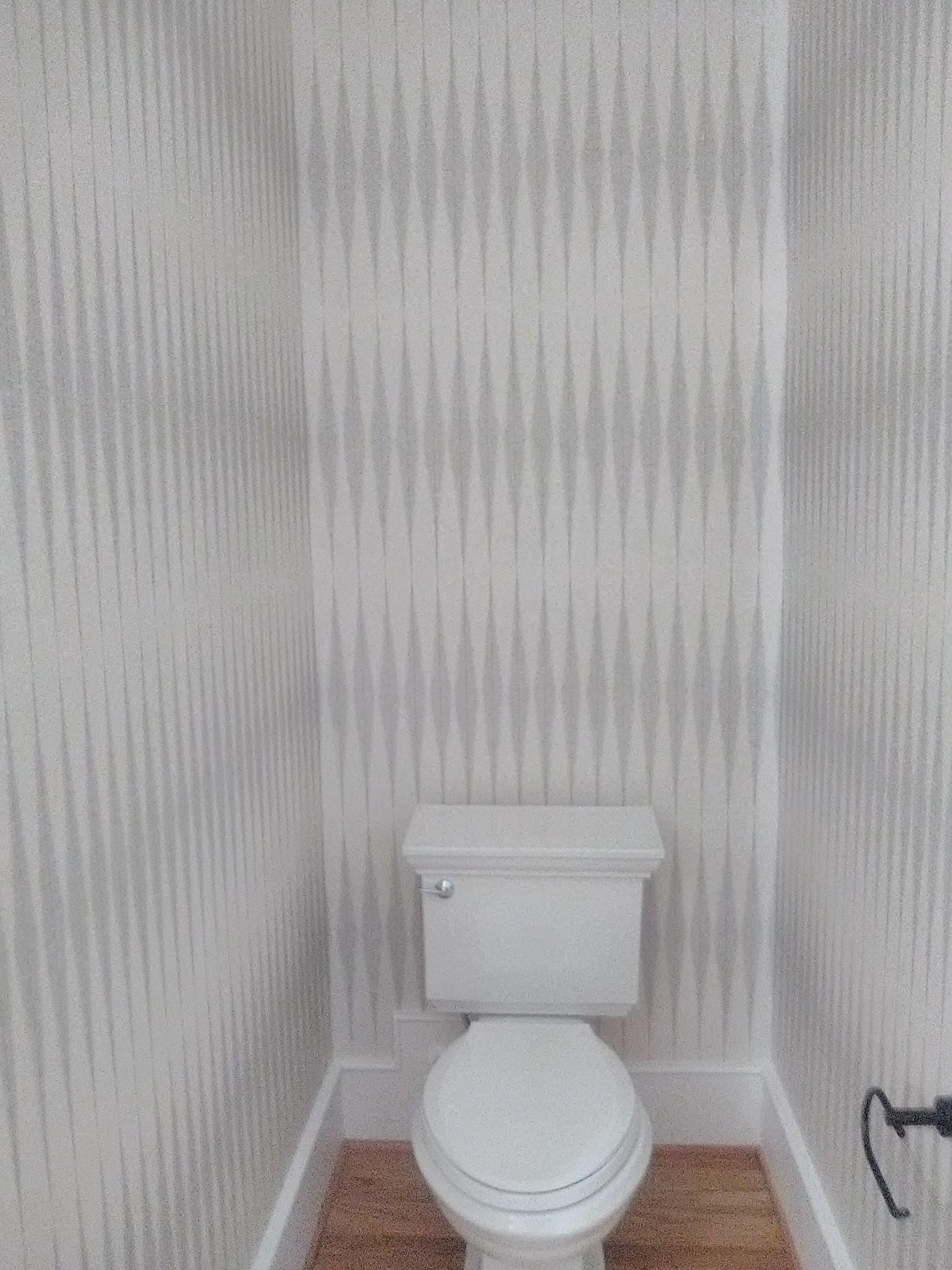
When looking at this wallpaper pattern from a reasonably close distance, it looks like elongated diamonds. But look at it in an alcove from a distance, and you see a horizontal striped effect.
A good reason to always look at the pattern in a room-set photo before purchasing, so you can see what it looks like played out on a full wall.
Either way, I like it. And it really makes this tall room look taller.
This wallpaper is by York, in their SureStrip line, one of my favorite papers to hang. It’s a thin non-woven material, is designed to strip off the wall easily and cleanly, and comes pre-pasted. This time, instead of their silly squirt bottle suggestion (which provides splotchy and inadequate coverage), or rolling diluted paste onto the back (which reacts with the pre-paste and forms a thick, gummy mess that dries too fast and traps air bubbles), I used the old-fashioned water tray method. I find this wets the paper and the paste better, and makes for a smooth surface, and the paper does not dry out before I get it to the wall (as it does when pasted the traditional way). I then rolled a thin layer of paste on the wall, to augment the pre-paste, eliminate blisters and bubbles, and reduce the chance of shrinkage.
This powder room is in a new home in the Timber Grove neighborhood of Houston. The interior designer is Stacie Cokinos, of Cokinos Design. She works mostly with new builds, or with homes undergoing major renovations. Her look is clean and open and calming … and I am seeing a little farmhouse look creeping in here and there.