Yesterday’s post focused on centering two desired motifs in between two windows. Today’s post is about centering a dominant design element on the most visible / important wall in a room. In this case, it’s the only wall that doesn’t have any windows or doors on it, and also the homeowners will have a credenza or other similar piece of furniture placed against this wall. This is also the first wall you see when walking into the living room from the front door. Note that the trim carpenter has set the bar , by placing his molding panels smack in the center of the wall. And they’re perfectly equally sized, too. Now I’m challenged, and have got to get my birds down the center of that wall. 🙂 In the photo, I’ve started applying my wallpaper primer to the wall on the right. That’s my paint roller tray hooked on top of my ladder .
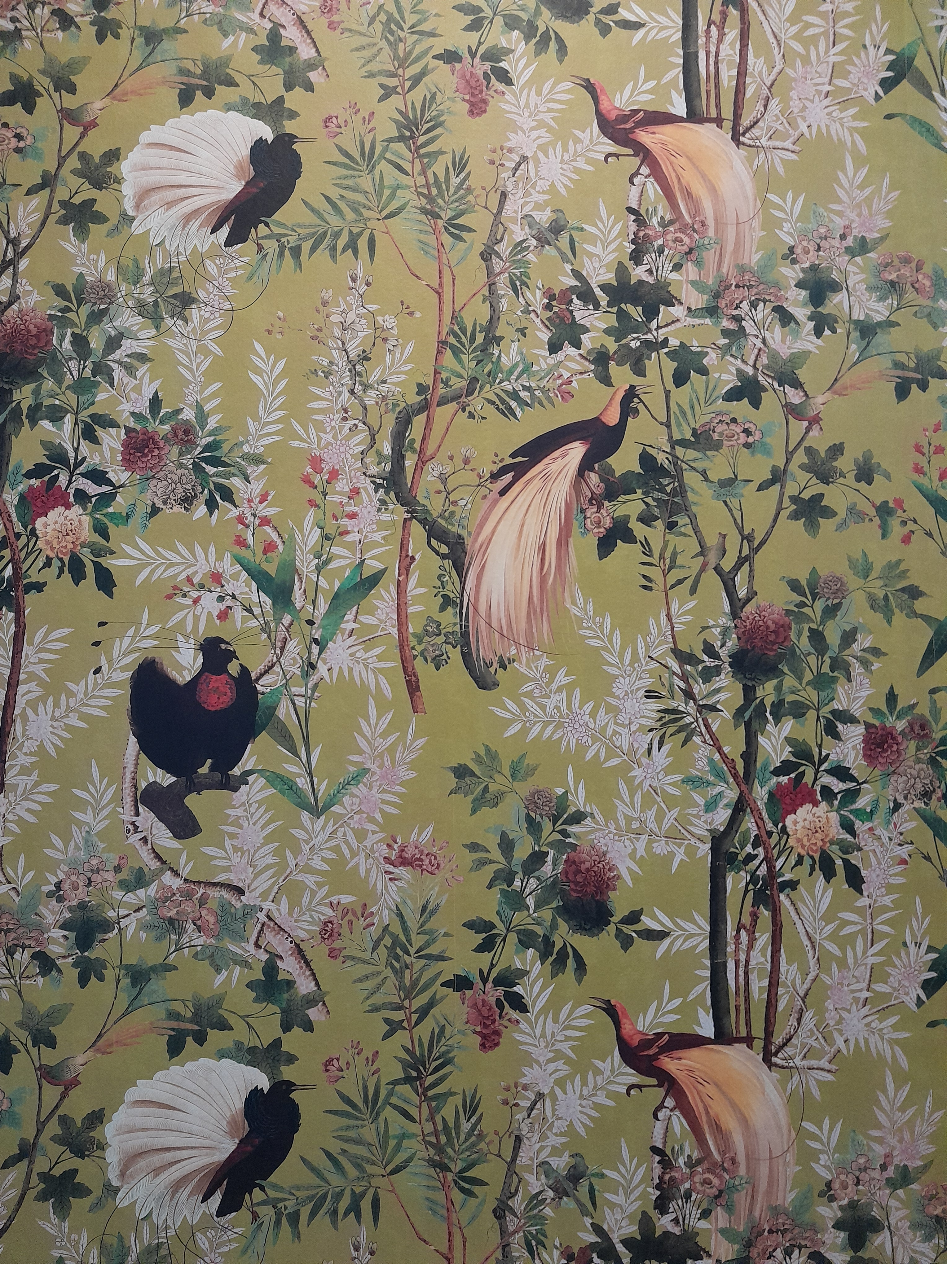
For reference, here’s the finished wall. The other three walls will be papered, as well. When I’m getting ready to hang wallpaper, I want to see what the overall pattern looks like. This, plus a little math, helps me know how to place the various motifs. In this case, to be sure (if possible) that no bird gets his head cut off at the ceiling, nor his feet cut off at the chair rail or floor. All that depends, of course, on the length of the wallpaper pattern repeat , as it factors into the height of the wall. Getting back to viewing the overall pattern on my phone – that’s often quite a bit more difficult that it should be, because most vendors just show a small portion of the design . And if the homeowner has purchased a sample, it also shows just an 8″ x 10″ or so section of the pattern. I want to see the whole design as it plays out across a wall, in what I call a room set view. If you check enough vendor websites, you may find such an image. But … quite often they’ve styled the photo with furniture (OK, that’s good, because it helps you see the perspective and scale of the pattern). But they’ll also hang artwork on the wall, add vases full of sprawling flowers , all kinds of stuff that occludes the view. But, most of the time, I’m able to find an image that shows what the whole pattern looks like on a real wall. Then I can determine what I think is the most dominant part of the design , or maybe some other feature that I want to put the viewer’s focus on. In this case (see photo above), I definitely felt that the black bird with his white tail feathers , as well as his black buddy just above him, were the most eye-catching . So those are the guys that I wanted to put in the horizontal center of the wall .
This pattern comes as a 3-panel set , and has a very long pattern repeat of nearly 40″. Here I am laying it out on the home’s entry floor (helpful that no one’s home and won’t need to go up and down the stairs or through this hall any time soon!). I’m using yardsticks (no, I don’t use no stinkin’ tape measurers – will be a blog post on that at some point) to plot how the pattern motifs fit in with the height of the wall, and hopefully not cut off anybody’s head or feet. The horizontal yardsticks are marking where I want the pattern to hit the top of the wall, as well as the bottom / chair rail.
Back to the two black birds . Here I’m discerning the vertical center of the birds. It’s a bit tricky, because the all black bird doesn’t sit perfectly centered above the other bird; he’s a bit off to the left. So you have to figure out what you think is the most pleasing center point of these two birds. I have the yardstick standing on edge to help find that point. (Try doing that with a tape measure!)
The yardstick is 9 5/8″ from the right edge of the wallpaper. Factor in that the yardstick is 1/4″ wide, and half goes to the left side and half to the right, I’m going to add 1/8″ (half of 1/4″) to my measurement. So my measurement from the right edge of the paper to the center point is now 9 3/4″.
Here I’ve measured the width of the wall and determined the center point. Note arrow marked “Mid.” But my center motif isn’t in the center of the strip of wallpaper, nor at either edge. It’s 9 3/4″ over to the left of the right edge. (Note, the wallpaper is a standard 20.5″ wide, which makes the middle of the panel at 10.25″. But that’s not where the center of the design is. So always focus on the center of the dominant motif , not the center of the wallpaper.) Back to placing my first strip … To keep the birds at the center point of the wall, I need to pull the right edge of the wallpaper over 9 3/4″ to the right. Marked with a pencil line and my word “ici” (French for “here.”) Side note – always make your marks on the wall and wallpaper with pencil or chalk . Never use ink or marker or wax crayon , as these substances are known to bleed through wallpaper and stain the surface. Do a search here to read more.
Here I’ve placed the vertical red beam of my laser level 9 3/4″ to the right of the wall’s mid point. This is where I’ll butt up my strip of wallpaper. The black and white bird should fall right at the center of the wall.
Just to be sure, before pasting or hanging the strip, I brought it to the wall to see how what I determined was the center of the motif, actually lines up with the center of the wall (“mid”). All seems good.
Here it is done. Laser level marking the mid point of the wall. As I mentioned, the two birds aren’t lined up perfectly symmetrically, with the smaller one sitting a bit to the left. Don’t stew over it … choose which part of which bird you want to base the center on, and go with it. All that said, standing across the room, the first three panel set I hung looked good – but just appeared a tad off-center to me (no pic). Like a half an inch. TBH, the mid point of the wall was at the center of the larger bird. But, because the bird has an uneven shape, and because of that smaller bird sitting above him and a smidgen off to the left, the whole scenario did appear just a teeny bit off-center. I kept thinking, what’s a half an inch? Especially when the homeowners are going to place furniture in front of it, plus a vase full of sprawling flowers. No one would notice anything off-kilter – except me. I debated a while, and finally decided to pull the three strips off and re-hang them 1/2″ to the right. This is tricky, because the wallpaper can be firmly stuck to the wall by now, and removing it could dislodge the primer and paint underneath it. Or pulling the paper off could stretch it, so that it might not fit the wall correctly, or the pattern match might get skewed. After testing to be sure the three strips were not irrevocably stuck to the wall, I removed them and re-hung them, one by one, this time butting up against the laser level red line moved 1/2″ to the right.
Here’s a close-up of how the laser level beam lines up with the center of the wall, the molding, and the wallpaper birds .
Finished wall again. See how balanced it looks to have those two dark birds lined up over the center of the wall and the panels below. The birds are also nicely balanced vertically, and no one got his head chopped off at the ceiling, or lost any feathers at the bottom of the wall. Note: We usually plot wallpaper motifs to hover just below the ceiling. But in a room with a wainscoting like this, it’s assumed that the wainscoting / chair rail are closer to eye-level, and thus it’s the main place you want to make sure the motifs don’t get compromised (if possible). In other words, you would position your motifs relative to the chair rail, rather than the ceiling .
Pulling off those three strips and rehanging was successful in large part due to a solid surface under the wallpaper. First, the builder ‘s paint was good quality and was applied over a sound surface – no dust , and no PVA primer . Also is that the wallpaper primer I use is designed to do many tasks. One of those is to facilitate removal of wallpaper. For most surfaces and wallpapers , I like Roman Pro 977 Ultra Prime . The wallpaper itself was a factor, too, as the non-woven substrates are tear-resistant , and don’t (or shouldn’t) expand when tugged on. They’re designed to strip off the wall easily and with no damage to the wall when you redecorate later. Lots of other advantages for NW materials, too.
The pattern is called Royal Garden and the manufacturer is Mind The Gap , out of Transylvania, of all places. The home is in the West University area of central Houston . installer
Re my post from May 12 … Here’s the living room before the wallpaper went up. Note the windows and the short space above them. The wallpaper that’s being used comes as a sort of mural , in a 3-panel set . Each panel has a different design . The part that drops below the window gets cut off, and really can’t be used anywhere else. See my post of May 12 for more information. I never throw any scraps away until the job is over, so I saved the bottom parts from under the windows, which were about 8′ long.
Here is that wall area done.
Look at how nicely the birds with the light colored tails fall around either side of these two windows. It gives a nice, balanced look. (I centered another motif on the opposite wall (see post from May 12), so, as the pattern worked its way around the room, the birds just happened to fall pretty evenly on either side of the windows. It was a fortunate happenstance.) But, with the 3-panel set working its way around the room, those same birds with the light colored tails were going to fall between the windows. This means that we’d have those birds appearing three times on a very visible section of the same wall. Even yuckier, if you look at the bird above the left window, as these two birds fell down between the windows, they would be pulled to the left of center, and also were 15″ wide, whereas the space between the windows was 12.5″ wide. This means that the one on the left would get his plumage cut off, and the one on the right would have his head cut off. And the tree branches they’re sitting on would be far off to the right. Not awful – that’s the way the pattern falls, right? But I knew I could make it look better. So I cut off and discarded the portion of wallpaper that would fall below and in between the windows. There was an empty wall space in between the windows. Not shown in the photo.
Instead, I took one of those scraps from the trash pile, that was cut off from under a window on another side of the room. It was too short to go from wainscoting to ceiling – but that was fine, because the area over the windows already had wallpaper on it. This panel had birds that spanned 13″ wide – so just a smidge of one’s beak had to be cut off. And, the red bird was one of the homeowner’s favorites. I cut the length of the panel so that the red bird would sit at the same height on the wall as the same bird in other parts of the room. See 2nd and 3rd photos above. After making sure the space between the windows was actually 12.5″ wide from top to bottom, I trimmed the panel of wallpaper around the bird motifs, to 12.5″ wide. Then I placed it in between the two windows. Now the two birds are perfectly centered in the space between the window – and the branch they’re clinging to, too. Again, the panel was too short to reach the ceiling. But that was OK, because there was already the piece with the light colored bird up there. Problem was, the pattern of the light colored bird’s panel didn’t match up with the pattern on the new piece I just put between the windows. The tree branch coming down from the ceiling didn’t match up with the branch just above the red bird. Sorry, no pics of this. So I overlapped the strips where they met. To disguise the pattern mis-match, I took a scrap of paper that had a tree branch of the same color, and cut a “branch” of appropriate size, and appliquéd it on top of the wallpaper, so it connected the tree branch on the top with the branch below it. There were still some sharply un-matched pattern motifs, so I took some more scrap wallpaper and cut out a flower and pasted it over. That’s the flower on the left, right below the top of the window. If you look really closely, you’ll see that the frilly white leaves on the left, and the green leaves on the right, don’t match up 100% perfectly. But, heck – no one’s going to be scrutinizing or noticing that. Much better to have the homeowner’s favorite red bird and its mate nicely centered between the windows.
The wallpaper pattern is called Royal Garden and is by Mind The Gap . See other posts for more information. installer houston
Border around top of bathroom in a 1929 house on the homes tour in Galveston, Texas. Note the fringed bottom edge. Back in the ’90’s, similar laser-cut borders were popular.
I don’t know if this border dates all the way back to when the house was built, but it, and other wallpaper in the home, are definitely quite old; no newer than 1950’s. It’s amazing that it’s adhered all these years, and the colors have never faded. Borders that complimented the paper on the walls, were used around the ceiling line in almost every room way back then, and sometimes around windows and doors, too. I love these old papers!
North wall before. The walls had a tad of texture, left by the thick nap roller used by the painters . I usually like the walls to be perfectly smooth , so I do a lot of skim-floating (do a Search here to read more) and sanding to smooth the walls. But in a large room like this, that can add one to two days, so it ups the install price . The existing wall texture is pretty light, and this brand of wallpaper is fairly heavy . Plus it’s a busy pattern . So it’s not likely that anyone would notice a little texture under the wallpaper . After discussing with the homeowner, we decided to skip the smoothing time, expense, and dusty mess, and simply go with a primer.
Here’s the primer I like under wallpaper . By Roman , called Pro 977 Ultra Prime . It will stick to the light gloss on the existing paint . And it provides a good surface for the wallpaper to adhere to. Wallpaper primers are designed to withstand the tension put on seams as the paper dries and shrinks , and to hold the edges of the paper nice and tight to the wall . A good primer also allows for sliding the strip around on the wall , or pulling off and repositioning , if needed. And makes it easier to remove / strip paper when it’s time to redecorate .
Finished north wall. Note I centered the dominant motifs ( black and lg round white birds ) on the wall, which looks nice with the carpenter ‘s expertly centered molding panels below. More on this in a future post.
Laser level helping get bird motifs centered on wall .
South wall before
South wall done.
Note birds centered between the windows . More on how I did this in a future post.
This pattern comes as a sort of mural, in a 3-panel set. One roll = 3 individual panels. Each panel is 20.5″ wide x about 10′ high. Because of the wainscoting , the wallspace to be covered with wallpaper was only about a bit less than 7′ high. This means that at least 3′ of the strip would be cut off and not used. In addition, the design has a pattern repeat of more than 3′. This is way longer than most, and it means that we can’t count on using the portions cut off at the top or bottom anywhere else. So, like I said, into the trash pile they go. Important to note, when calculating how much to purchase, with this long pattern repeat and 3-panel set, even for shorter areas over doors and windows (19″), you can only plan on getting one strip out of each panel. So, again, a whole lot of this material will go to waste. And, again, another reason to let the installer calculate how much to buy. Again – it’s not about square feet! Moving on … After looking up the pattern on the company’s website, to get an idea of the full scope of the design , in the photo above, here I am, laying out the goods on a wide stretch of floor space in my client’s house. I’m comparing the height of the wallspace with the length of the pattern repeat, and the placement of each bird – so that once the wallpaper is up on the wall, no bird gets his head or feet or bum cut off. Sometimes, the math and the placement just don’t work out, and someone gets chopped in half. But here everything works out, and the birds will fall nicely and fully intact, down the height of the wall. Additional thoughts … Don’t forget to add two inches (2″) to both top and bottom (total of 4″) of your strip, to allow trimming at ceiling and baseboard / wainscoting , and to accommodate un-level ceilings and floors, and wonky walls. Also, in most cases, we installer s like to place a key motif or design element at the top of the wall. But when there’s wainscoting, like this in this room, the eye is drawn more to the bottom of the wall, which is the wainscoting. So here’s where I focused on placing the most dominant and visible birds. Also, if the dimensions worked out so you did have to end up with someone getting his head cut off, you’d put that at the top of the wall. And keep the whole / intact motifs / bird(s) at the level of the wainscoting / or, closest to eye level .
Close up of the design. This pattern is called Royal Garden , and it comes in several colorways . It’s by Mind The Gap , who is a company pretty well known for innovative / adventurous ways to dress up your walls . Most MTG wallpapers are packaged differently from standard papers . So, again – don’t order until the installer has measured and calculated . Their wallpapers are on a non-woven substrate , which can be hung by pasting the paper or by pasting the wall. I found that pasting the paper was the best option. More on installation techniques in a future post . Most non-wovens are stain-resistant and tear-resistant . And they are designed to strip off the wall easily and in one piece, with no / minimal damage to the wall when you redecorate some years later. One more thing about MTG wallpapers … Once you unroll them, and especially if you roll them backwards to get rid of the ” memory ” – the desire to stay tightly rolled up. If you unroll them, they unfurl and get stiff , and they spread out all over your room , and are difficult to corral for measuring , trimming , pasting , etc. All that considered, I do like this company. Mostly because of their innovative designs . They’re based in Transylvania , hence the bat on their label . If that doesn’t mean anything to you young ‘un’s , look up the book / movie / story / legend Dracula . And also because of (relative) ease of working with their material. See future posts for some techniques that were necessary with this brand . The home is in the West University Place / West U neighborhood of Houston
There are a lot of issues with grasscloth and other natural materials (read link to the right of this page), namely visible seams , color variations , stain easily. So I like to steer clients toward the faux options. These are much more consistent in color , so much more pleasing on your wall. Most of them also have a pattern that can be matched . Meaning, that a horizontal strand of “grass” on the left side of the seam will match up with its mate on the right side of the seam. This way you don’t have the eye-jarring breaks running the length of every seam. But it also means that you’re going to see the same motifs and patterns at the same point on the wall on ever strip. In a real room, you don’t notice this much. But it shows up more on photographs. Look above. You’ll see horizontal bands of color running across the wall. This is a straight match , which means that the same design is in the same place on every strip. If the manufacturer had made this a drop match , the horizontal lines would appear at the same height on every other strip, and be in a slightly higher or lower position on the strips in between. Depending on the pattern, usually a drop match is a little easier on the eyes. But it does still have the repetition across the wall … just spread out a bit. If the installer hangs all the strips in the room like this, you’ll end up with a sort of banding effect, wrapping all the way around the room. Nothing wrong with that. I’m just pointing it out. Personally, I’d match the pattern on a given wall, but change it up on the other walls, so that the bands will fall at different heights on different walls. With these faux natural materials , you also have the option of ignoring the pattern match and hanging them with a random match , meaning that you don’t bother to match the pattern at the seams . This would mimic real grasscloth or silk , as you would see each individual panel more clearly. This particular material is pretty homogeneous color-wise, so you wouldn’t have any abrupt breaks in color or texture at the seams. Also, this vinyl material is 39″ wide, and real grasscloth is 36″ wide, so you’re getting a pretty authentic look. But know that most of the faux grasscloths are the more standard wallpaper widths, of 20.5″ or 27″. Seeing all the panels distinctly on a narrower width could end up looking somewhat busy.
Re my previous post, there were some disappointing issues with the faux silk wallpaper ; some caused by shipping , and some inherent to the material itself. First notice the white splotch on the right, two of them, in fact. A few others appeared throughout the bolt, but not as bad, and I was able to cover them with pencil. Next is edges that got banged up during shipping , as you see here on the right. Some paper wallpapers will dry out and flatten down pretty nicely. But thick vinyl like this won’t flatten out, and these creases will reflect light and catch the eye.
Here’s the back side of the paper, showing more of the damaged edges. We had two double roll bolts of this material , and both had this damage. But one was much more severe, and pretty much unusable. Even when I rolled off several yards, edges deep inside the bolt were banged up as well. If I tried to trim off 3/8″ or so from the edge, it would mess up the pattern match. The other roll was also banged up, but not as badly, so I went ahead and used it. I rolled off the outer yardage , and took my strips from the inner, less damaged material. I spent a lot of time plotting where to place my strips, to minimize the exposure of the dents. For instance, since the worst bangs were on the right side of the strips, I placed that strip where the right side would be mostly cut off by trimming around the window. See previous post for pics.
But wait … There’s more! This is about the last 2′ deep inside the bolt. Obviously caught in the machinery and crimped as it was being wound up into a roll. If I had been planning to get four 8′ strips out of each 33′ long double roll bolt, losing this 2′ length would have meant we wouldn’t have enough paper to do the room. Another reason to always buy an extra double roll. In addition, the backing on this material was difficult to cut through, as it liked to drag and shred , even under a new trimming blade. This left little jagged shards of white backing sticking out, that I had to go back and trim off with a scissors . installer houston
Before. The family’s interior designer helped them choose the deep blue color for the other three walls .
Done. The colors in the wallpaper coordinate beautifully with the wall paint . The desk will sit against this wall, as well as a flat screen TV and/or computer monitor screen. The look is encompassing and stately, and perfect for a room that will foster concentration and decision-making . That’s my work table in the foreground – covered with a blanket for overnight.
Unlike actual natural silk or grasscloth products, where the seams and separate panels are very visible, this man-made vinyl material has a pattern that can be matched , so you don’t see the breaks between panels . Although the texture is subtle, you can see its warmth clearly from across the room .
The manufacturer did a super job of mimicking the look of real silk cloth wallcovering . But this vinyl option on a non-woven / paste the wall backing is much more resistant to stains , easier to install , and will strip off the wall easily when it’s time to redecorate .
The brand is JV Italian Living . The paper was a little different in that the strips were 39.5″ wide, whereas most papers are 20.5″ or 27″ wide. So a bit more tricky for short stuff me to work with. It was nice to have the non-woven backing. But note that it was fragile and difficult to cut through. See other post for other issues. installer houston
Look at this narrow space we wallpaper installer s have to squeeze into! Less than 3′ wide. Note how I can’t even fully extend my ladder’s legs. Meaning that I’ll be off-balance while standing on sloped steps, and trying not to bop the left wall with the top of my ladder or the folding shelf, while the rear side of my body is trying to not scrape or lean into the wall on the right. Now try to envision this with the powder room door swinging inward into the room, taking up more space (they don’t have to do it this way, but most builders still do (Google it). And me having to move the ladder and jimmy around it every time I need to leave or re-enter the room (which is very frequently). Me, ladder , tools , toilet , vanity ,… and door ! All sandwiched into this 3′ x 8′ space! I mentioned this to the homeowner, and how inconvenient it is / makes me want to pull my hair out!
Next thing you know, Hubby came in with a nail-set and a hammer , and within 3 minutes (no kidding – I timed it!), he had slipped the pins out of the door hinges and pulled the door off and out of the room. Look at the very far left of this photo. Whew! Very grateful!
Originally, this powder room was painted a bold orange . The homeowner thought that was what she wanted, and so lived with it for a few years. But yearned for something more lively and fun. In this photo, I’ve skim-floated and sanded the walls smooth , primed , and am now ready to hang wallpaper .
Just – WOW! Wallpaper really perks the room up. This pattern injects both color and visual movement. And a big smile on your face!
Vanity / sink wall .
The wall to the right will be painted a dark pewter metallic . The homeowner has three heirloom mirrors in the cathedral style , that are tall and skinny, and fill out this wall perfectly .
Close-up
Rolling bolts out on my work table, to get dimensions , pattern repeat , pattern placement , check for any irregularities, and etc.
This wallpaper is called Brushstroke Floral and is by York , one of my preferred brands. It’s non-woven material and can be hung by the paste the wall method , or, as I usually prefer, paste the paper . There were some issues with this paper; please refer to future posts . The home is in west Houston . installer This wallpaper pattern is by York, and was bought from my favorite source for good quality, product knowledge, expert service, and discounted price – Dorota Hartwig at Sherwin-Williams in the Rice Village off Kirby. (713) 529-6515. She is great at helping you find just the perfect paper! Discuss your project and make an appointment before heading over to see her. Call first, as her hours fluctuate. My clients love working with her!