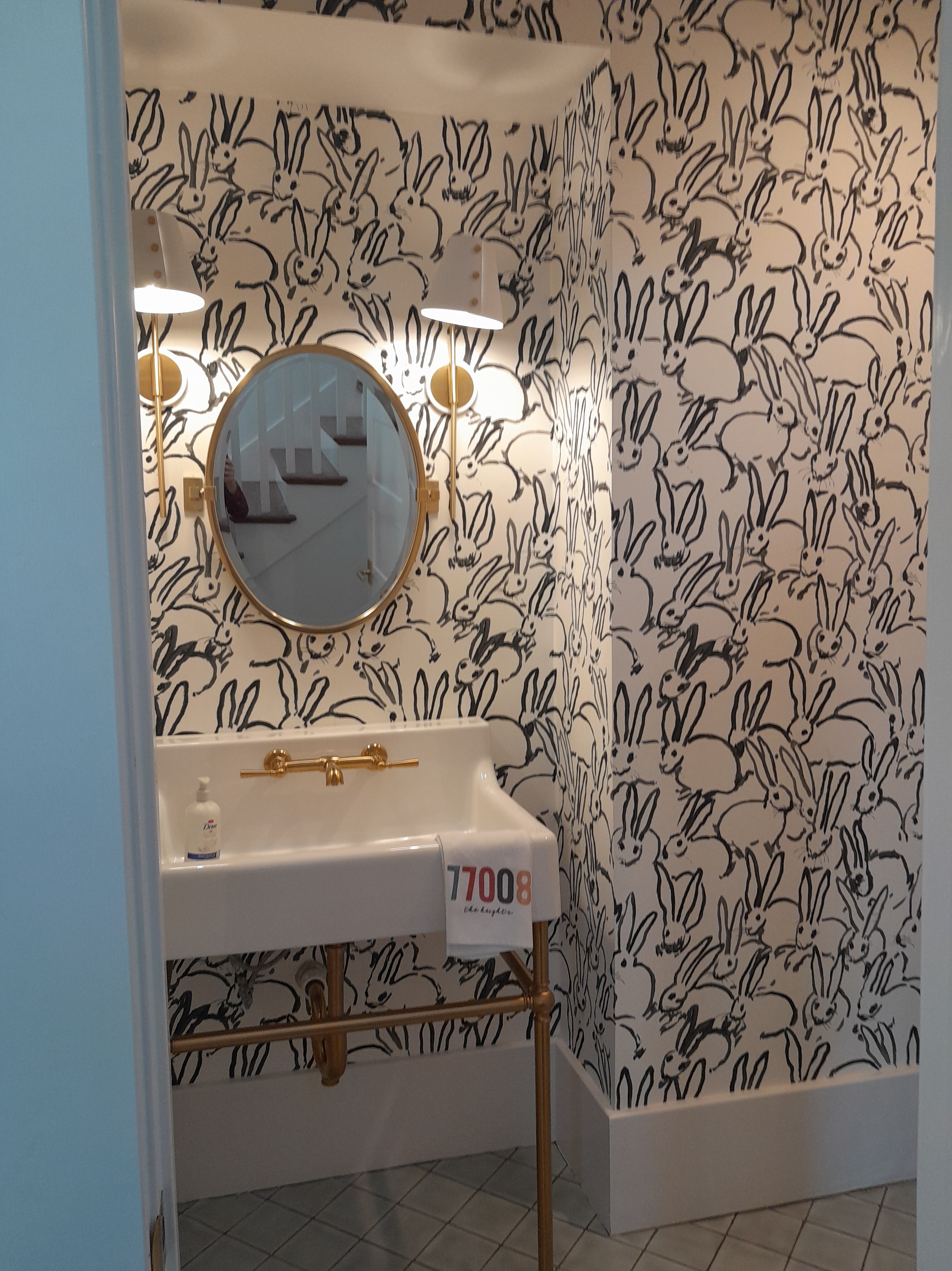
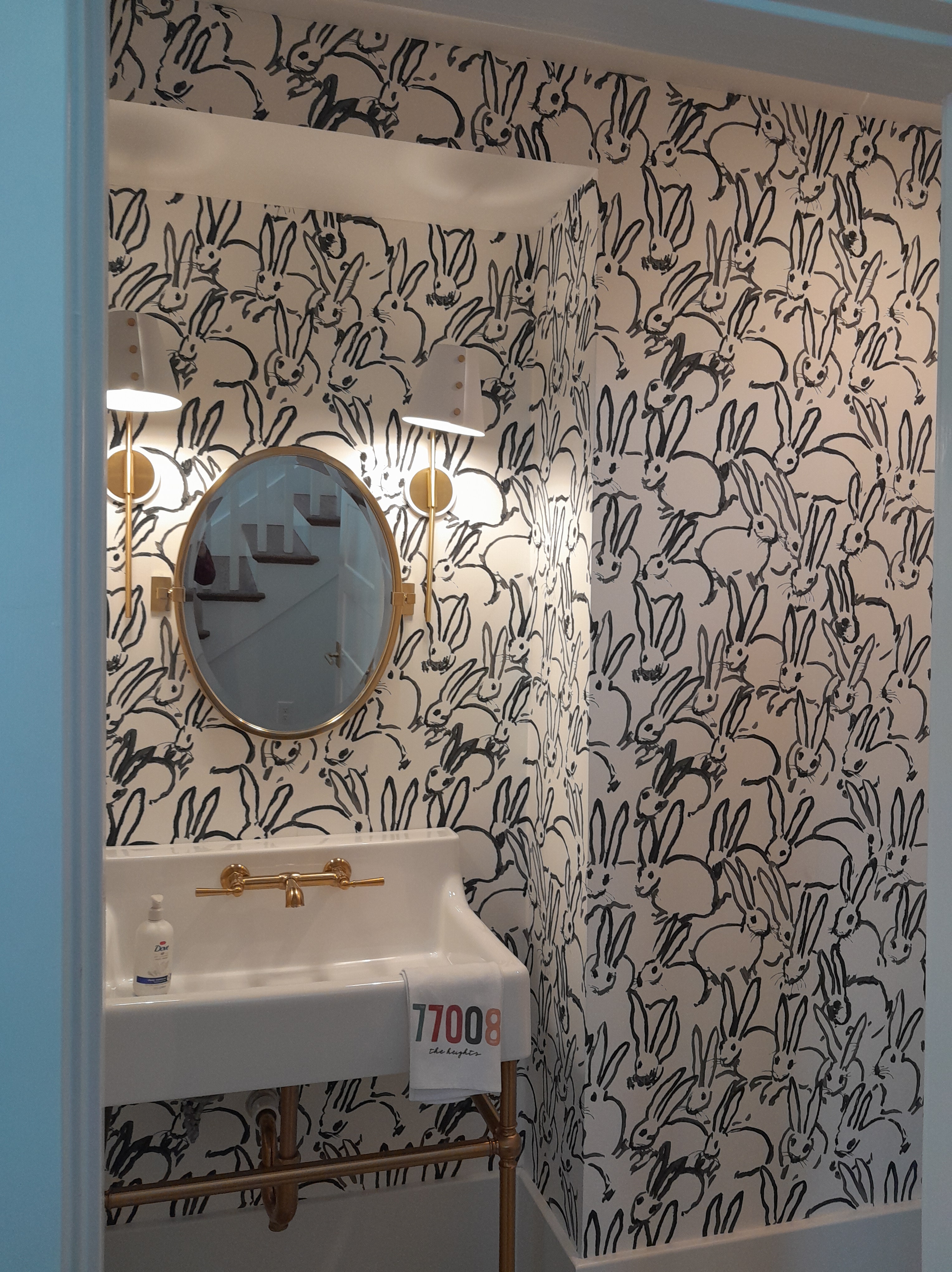
I saw this wallpaper in a powder room while taking the Houston Heights Home Tour last Sunday . This pattern was wildly popular about 10 years ago. Imagine squeezing under that console sink with metal legs to place the wallpaper under there.
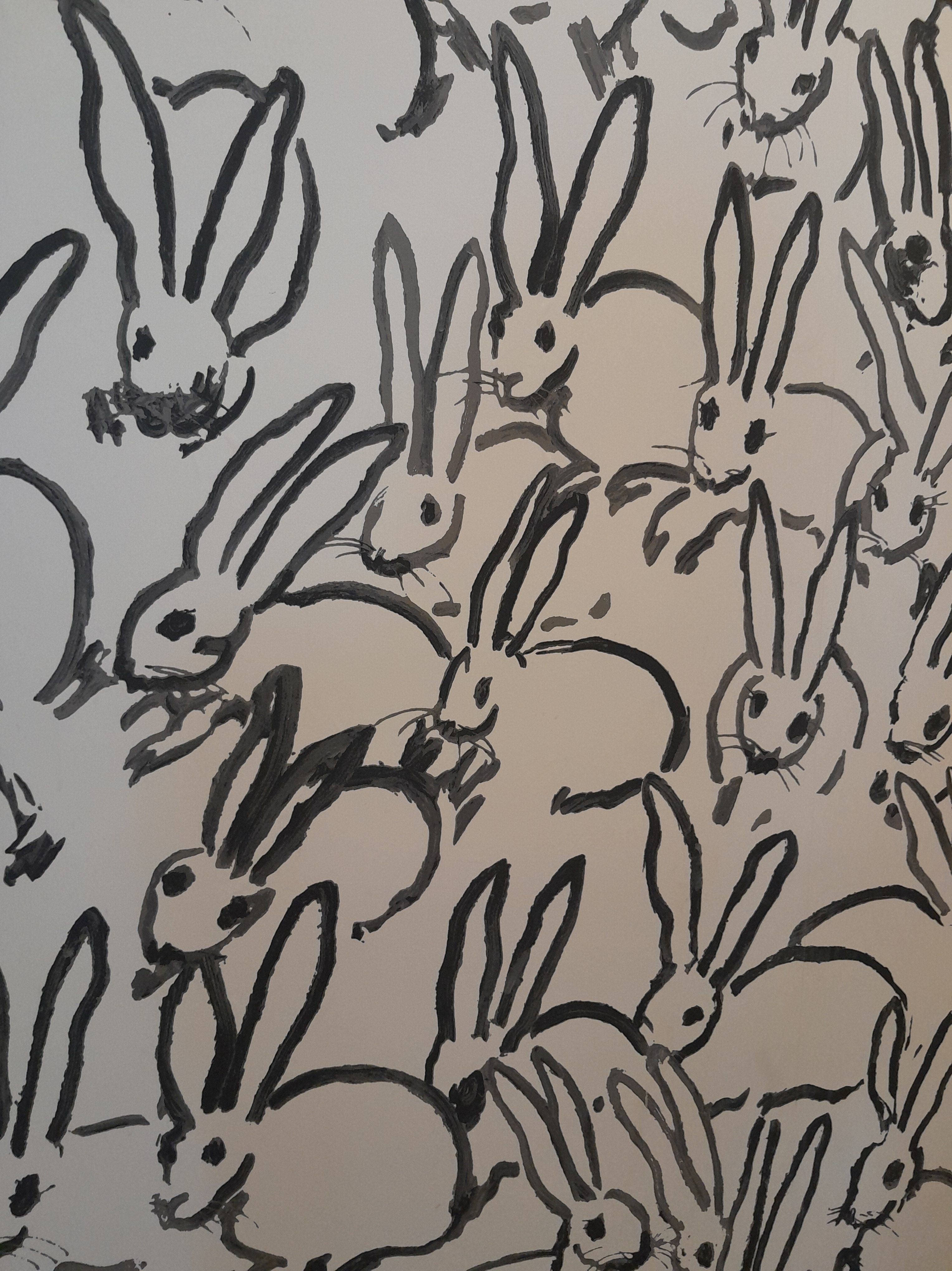
Another shot, showing a little more of the fir down / soffit over the sink . According to Wikipedia , the designer, Hunt Slonem , started developing his obsession with all things bunny in the early 1980’s . He’s produced lots of different incarnations, and they’ve been used in wallpaper , fabric , artwork , kitchenware , decorative items , and everything in between.
Such a fun pattern. “And they breed like – rabbits!” This wallpaper is notoriously difficult to install . More on that in a future post.
The nursery before. I have skim-floated and sanded the textured walls to smooth them, primed , and now it’s ready for wallpaper .
Not your average baby’s powder blue or teddy bears ! Mom saw the look and fell in love with it. Here’s how the manufacturer’s website described it: “Channel the spirit of the Scottish Highlands with our take on iconic tartan plaid.”
Big screen TV will go on this wall.
The mom recreated everything she had seen in her inspiration photos , including the black crib and dresser / changing table .
The pattern is called Equestrian Plaid . The parents are debating over finishing touches that lean toward a horse or racing theme , or a ” to the hunt ” look.
I’ve hung plenty of the Mind The Gap brand before, but this is the first time for their Complimentary line. It’s packaged in rolls rather than their usual panels , and has a repeating pattern , so you might get a little extra paper , like short left over ends that can be used over doors . Like their other lines, this is a non-woven material and can be hung by the paste the wall method . And it will strip off the wall easily and with no / little damage to the wall when you redecorate down the road. It’s nice stuff.
Oh, and each roll / bolt comes wrapped up in its own individual box, complete with satin ribbon. Snazzy! The home is in the greater Heights area of Houston . Read future posts for more on this install .
Before. The new(ish) home has a Victorian look, with carved and stained molding , and the decorative corner pieces at the baseboard . And, yes, those corners are time consuming to trim around. Will post more on that another time.
Done. Since the Prada store is the most dominant motif , and also symmetrical , I centered them on the sink wall. This will look nice when the mirror goes back up, as they should be spaced equally on either side of the mirror.
Marfa , Texas , holds special significance for this family of teenaged boys , and the mom saw the pattern and knew she wanted to use it somewhere. A powder room always looks bigger and more fun with a little pattern and color on the walls. She went with the dark green colorway , which looks nice with the stained woodwork and also with other elements in the home’s décor . I didn’t realize until I started working with it that some motifs are dark green , some are black , and there is some very light grey in the mix, too.
The City Toiles line is very popular and features scores of cities in the U.S. and abroad. Fancy wrapping, too. These plastic bags are really heavy. I saved some to wrap my primer and paste roller covers in.
Katie Kime is the brand. Their paper is a little narrower than most brands, so doesn’t give quite the same coverage . It’s a pretty heavy vinyl , which should be fairly stain-resistant , on a non-woven backing , which makes for easier installation and then removal later. If I had my druthers, though, I’d prefer a thinner vinyl. KK does usually come with some relatively minor “issues,” which will be addressed in future posts.
This cabinet in a bar in a home in the Heights area of Houston is normally full of glass stemware , tumblers , and the occasional martini shaker . The homeowner wanted something to snazz it up, and add some color and contrast behind the clear glass. Note the wooden braces under the shelves in the back of the cabinet. We discussed whether or not to cover these with wallpaper . Decided that leaving that support board white would look distracting . So I wrapped the wallpaper around them. Also discussed papering the sides of the cabinet. Felt that would be too dark and claustrophobic, and that we wanted the glassware to be the focus, not the wallpaper.
The paper really pops with brightness . But the pattern is small enough that it will set off the barware, rather than swallow it up or outshine it.
The pattern is called Juniper Forest and is by Rifle Paper , made by York. This was purchased from my favorite source for good quality, product knowledge, expert service, and discounted price – Dorota Hartwig at Sherwin-Williams in the Rice Village off Kirby. (713) 529-6515. She is great at helping you find just the perfect paper! Discuss your project and make an appointment before heading over to see her. Call first, as her hours fluctuate. My clients love working with her!
For whatever reason, sometimes having to do with placement of the floor joists and where the drain pipe can go, this toilet was placed very close to the wall. I had a hard time slipping the paper down behind it. Luckily, the non-woven / paste the wall material is durable , and held up to some tugging and folding. Evidently, some repairs were done to the wall, as you can see around the decorative plate that’s meant to hide the hole behind the water supply line pipe . Because the toilet is so close to the wall, and the pipe is so short, the plate (called an escutcheon ) was jammed actually recessed into the wall. I usually remove the escutcheon so I can trim the wallpaper close around the pipe, and then replace the plate so it covers the cut edges. Was completely unable to do that this time. It’s wedged in there between the wall and the pipe bolt way too tightly. This only sticks out maybe 3/8″ , but still would distort the wallpaper that needs to fall over it. So with this sticking out from the wall, how am I going to get wallpaper around it and down to the floor, and still look nice?
My first plan was to just let the wallpaper bridge over this plate. But, as you can see, it didn’t conform to the plate, leaving a lot of un-stuck area on the left side. It also didn’t adhere to the wall adequately on the bottom side of the plate.
So I decided to give the paper more ease and play, by trimming it more closely to the round outer edge of the plate. This was a little tricky, as I still had that rough area and gaps on the wall around the plate, as in the 2nd photo above. It also was difficult to get a hand and tools down behind there to trim neatly. I do think it turned out pretty well. Not likely anybody’s going to be scrutinizing it, anyway, down there behind the toilet.
This classic Chinoiserie style mural is called Fenimore and is by Paul Montgomery , by Mural Source . It looks a lot like the very high-end hand-painted silk murals that come from China , but is much more durable , stain-resistant , easier to install , easier to remove , and much, much lower price to both purchase and install . Heights bungalow Houston hall bathroom
Done. Oh, man – what a beauty this is! A large mirror with a 1″ wide gold frame will hang on this wall. I centered the pattern so the branches would fold evenly around both the left and the right side of the mirror.
Toilet wall shot before
Toilet wall done. The color is a little more emerald-y than the photos show. It’s really a very pretty design , and colorway . Really pretty!
I often hear clients say that they want their small powder room to look like a jewel box . Well, here it is!
Before hanging (or cutting!) any paper, I want to see what the whole design looks like. Vendor websites will usually show you a close-up of the pattern. But it’s really hard to find a picture of the whole design . Additionally, this pattern has a really long repeat (51″), so I can’t really roll it out on my 84″ long table and see what it looks like. So here I’m taking advantage of the homeowner’s open floor space, and rolling some bolts out on the floor. The yardstick shows where I’ve decided to put my ceiling line. And now I can also see how the trees and branches work their way up the wallpaper. After a little measuring and math, now I know where to position the strips on the wall ,,, so those branches and birds will surround the mirror the way I want.
Very pretty with the dark gold metallic outlet cover and switch plate , and hand towel ring . It was a little tricky trimming around the swooped backsplash .
This is made to mimic the silk murals that are hand-painted in China . But at a much more affordable price, and a much easier material to install , more stain resistant , and easier to remove when you redecorate .
Flowers This is a non-woven material, also called paste the wall , and is fairly fool-proof to install . The pattern is called Sakura and the brand is Thibaut . The company makes a similar design that’s called Jardin Bloom that is a 3-panel mural , rather than rolled goods with a repeating pattern. I hung that a few months back. https://wallpaperlady.wordpress.com/2023/12/23/stunning-chinoserie-mural-on-library-accent-wall/ installer houston flowers
Sink wall before. I’m getting ready to start applying wallpaper primer – note the roller tray and brush. On the right – that’s a baby’s T-shirt, protecting the toilet seat lid.
Sink wall done.
Long wall before.
Done. This style pattern is called a Chinoiserie . This one comes as a mural , in panels instead of rolls . With murals, every panel is different, so you don’t have the repeating designs of standard wallpapers. This one was custom-sized to the dimensions of the walls in this bathroom .
Fresh and airy.
So pretty, with the white bathroom fixtures , the countertop , and the floor tile .
Close-up. This is an economical option to the $$ hand-painted on silk murals imported from China and elsewhere. It has the same artisan look, but is much more affordable . The non-woven backing is much less complicated to install , and also easy to remove when you redecorate later. And much more resistant to water and stains than real silk!
This is intended to mimic the look of the hand-sewn and hand-painted murals made in China . Those products are made of rectangular blocks of silk, meticulously sewn together, and then painted. Here you see that the artist has recreated the look of the individual pieces of silk. And the motifs look as if they’ve been painted by an artist .
All the panels for this, plus another mural (for the dining room ) came rolled up in one huge (and heavy!) bolt.
Here I am, using the homeowner’s open floor space to roll everything out, cut the panels apart, rough-trim off the selvedge edges, check pattern match, and check panel sequence. This photo is actually the mural for other room, but you get the idea.
This company doesn’t pre-trim the panels, so you have to take a straightedge, razor blade, good lighting, and a lot of time and patience, to carefully trim off the unprinted edge.
The company provides a schematic / mock-up of where each numbered panel will sit on which wall. Note that, except for the left corner over the door, the widths of the panels do not line up with the corners of the room. Panel 17, for instance has to be measured, then split in two vertically (remember that straightedge and razor blade?!), so that about 8″ of its left edge sit on the right side of the north wall, in the corner over the vanity. (Note that they don’t tell you that the width should be 8″ … I had to figure that out myself.) The remaining right portion of Panel 17 then goes onto the east wall, starting in the corner, over the vanity. Likewise, Panel 18 hangs mostly over the right side of the vanity, but 10″ of it runs down the full length of the wall, behind the toilet (not shown in the schematic). Panel 19 is a bit too wide for the remaining wall space, so about 5″ of its right edge was trimmed off at the right side of the east wall, which abutted the shower. Side note: If you like math and engineering , spatial relationships, and working with your hands, you’ll probably love hanging wallpaper. This mock-up diagram is very important. Only thing is – the company did not include it in the package with the wallpaper . And, when I called the home office, I got a recording and left a message – but they never got back to me. So here I am, trying to get this paper up for this nice couple, but with no clue as to how the custom-printed material had been fitted to each specific wall. Luckily, the homeowners were reachable by phone (I was alone in the house while they were at work), and had copies they were able to text and email to me.
This design is called Fenimore and it’s by designer Paul Montgomery . The manufacturer is the Mural Source. Their material is pretty nice, and the seams went together well . I would prefer, though, that they pre-trimmed their goods. And the 36″ width is a bit cumbersome to work with. I’m kinda short, with a small wingspan. (Most wallpapers are 20″ – 27″ wide.) Oh, and the part about not including the diagram with the panels – they need to do better on that! The home is in the Heights area of Houston . installer
…But it sure looks like one! No all-white minimalist décor for these clients. Their home is filled with warm colors , antiques , and elegance .
So this luscious mural depicting life in early colonial Virginia fits right in.
This mimics the look of the imported hand-painted works on silk , which can cost $1000-$2000 per panel. And require extensive and expensive installation techniques. This mural is much more budget-friendly, and on a nice non-woven substrate, so easier to install.
The windows really stand out, with the thin strips of mural in between them. I kept the height of the background at the same height of the scenes on either side. At first, I had blank sky at the top. But got to looking at those trees over the windows and decided that the leaves needed to extend under the windows, too. I used scraps to piece in the dark area that fell below the height of the wainscoting . The homeowner was able to choose the panels she wanted, and specifically asked to have tree tops showing above the windows.
That’s my work table set-up out in the adjoining room.
The mural comes in panels, and is custom-sized to the walls … but not so intricately as the expensive brands. You just send good measurements and drawings , and the company works everything out on the computer. The material is digitally-printed .
Corner shot of river and village .sheep wheat harvest
Beautiful matt finish, and a hand-painted appearance . cows
The company provides a schematic of where each panel will fall on your walls. This is essential, before getting started on the install . Unfortunately, they didn’t include it with the material. And my call to their office went unanswered and unreturned. Not happy about that. Luckily, the homeowners had been emailed the diagram s , and were able to print them off and give them to me.
All the material for this dining room , plus the hall bathroom that I’ll do tomorrow, came in that one huge roll.
A lot of open floor space is a big help. Here I am rolling it all out, cutting the panels apart, checking sequence and pattern match, and doing a rough removal of the selvedge edge.
The panels are not pre-trimmed , so you have to take a straightedge and razor blade and meticulously trim off the unprinted edge . This takes precision and time and can be pretty tedious. Not really a DIY feature. Most other brands of digitally-printed murals come pre-trimmed . Also, these panels were 36″ wide, which are tricky to work with on my 33″ wide table, plus somewhat difficult for lil’ ol’ short stuff me to handle 9′ up on the ladder.
This is called Virginia Mural , by designer Paul Montgomery , and is by the Mural Source . The home is in the Heights neighborhood of Houston.
I hung this funky wallpaper just a few years ago, in the powder room of a renovated bungalow in the Woodland Heights area of Houston , and am back to do another room in the home.
I super-love the way the homeowners kept the original shiplap wood wall, which you see on the right. Three walls in the room were covered in drywall , but they kept this one wall with the wood exposed . It is the natural color , but was coated with a sealer , which brings out the color and grain of the wood . Nails , cracks , joints , and all – I love this look, especially next to the earthy feeling of the wallpaper pattern. The design is called Hoppet Folk and is made by Borastapeter … It’s very popular , and is sold by many different vendors .
A new desk is on its way. This is the slightly recessed nook where it will sit. The other walls in the room have already been painted a color that coordinates with the wallpaper . Right now, the wall has a heavy texture , typical of new tract homes.
Here I’ve finished skim-floating the wall, sanded it smooth , and have applied my primer / sealer Gardz . All that has dried, and now we’re ready for wallpaper .
Done! What a way to brighten up a work space!
Close-upCloser-up. More on this design below.
Now for some info on technique , next several photos …. Because this paper is basically dark in color , and because wallpaper can shrink as the paste dries and sometimes leave tiny gaps at the seams , I like to color under where the seams will fall with a dark(ish) paint. Here I’ve pre-plotted where the seams will fall (works with non-woven papers because they don’t expand when wet with paste – but not with traditional papers because those do expand, and you can’t plot ahead of time exactly where seams will fall, so you have to measure after each strip and plot where your next seam will fall.).
I use craft paint from the hobby or art supply store – diluted , because you don’t want to completely cover up your wallpaper primer . That primer has a job to do (Number 1 is helping to hold the seams down ), and it can’t do so if a heavy coat of paint is on top of it. I apply with a bit of sponge . And use a heat gun to speed drying time . I also run a bit of black chalk along the edges of the wallpaper. Do a search here to read more about preventing white from showing at the seams .
I measured and determined the center of the wall, and used a pencil to draw a plumb line . Sometimes I will use a laser level to shoot a line onto the wall. Here the first three strips are up. There are lots of reasons to start in the center of the wall. First, you can center / balance your pattern . This is a very rhythmic pattern, and would look best when placed evenly in the center of the wall. Also since walls and corners are never perfectly straight or plumb , you don’t want to butt a straight strip of wallpaper up against the corner. With this method, you’ll be able to trim your last strip into that final corner, making sure that your cut will follow the slight contours of the corner. Additionally, because ceilings and floors are never perfectly level , and walls are never perfectly plumb , if you hang your strip of wallpaper against a plumb line , you can expect that the design will begin to go off-track , moving either up or down against the ceiling line and baseboard . If you start hanging in the left corner and move to the right, by the time you get to the right corner, the pattern could be way off-track ( sloping upward or downward ) under the ceiling , for instance. If you start in the middle , the amount of tracking will be split between left and right – and therefore less noticeable.
I usually prefer to paste the paper . And if it’s paper wallpaper, you have to. But, for just a simple accent wall requiring no intricate cuts or tricks, if it’s a non-woven material (won’t expand when wet with paste ), it works well to paste the wall. So that’s what I’m doing . Here you see my paste roller . The brush is used for cutting in around edges – corner , baseboard , ceiling .
I like the clear strippable 780 paste by Roman . It sticks well, is easy to wipe off woodwork or the face of the wallpaper, stays wet long enough ( we call that open time ), and won’t stain or blush non-woven papers , as some other pastes will. Do a search here to read more. And, yes, I write the date on just about everything I buy.
After the strips have been cut to the right length (leaving 2″ at both top and bottom to accommodate trimming and wonky ceiling and floor ), I roll them backward and inside out , with the top of the strip coming off first . This helps relax the curled-up material , and also prevents the printed side from bopping into the paste I’ve applied to the wall . I secure with elastic hairbands from the dollar store .
Note some slight pattern mis-matches across the seam . Slightly lower on one motif , and slightly higher on the motif below.
These are pretty minor, and don’t bother me at all, especially with such a busy design. In fact, they rather add to the hand-printed look of the paper. (OK, it’s really machine-printed , but who cares?! It’s pretty normal for printing presses to get out of register , especially when running several colors through the line .
Also, this is a gravure print , and results in this lovely raised ink effect . I love the feel and texture a lot.
Another look at raised ink , and slightly imperfect printing (not crisp edges ). It looks hand-made and artisan . Raised ink is about my favorite printing process .
We did encounter a few less-than-perfect issues with printing. Kinda typical of York brand. Although nothing serious , as this was on the back . Small ink splatters here.
But here, all along the edge of this one roll / bolt , ink . Maybe the ink hadn’t dried thoroughly before the paper was wound up into a roll / bolt, so it pulled off onto the backing . Indeed, there were a few smudged areas on the surface of this bolt. Nothing too serious, though.
The design is called Butterfly Garden and is by Ronald Redding . It’s based on a design by CFA Voysey, who was a designer back at the turn of the last century . Cool, somewhat surreal stuff. I have his Bat and Poppy in my powder room . Do a Search here to see posts. Voysey was heavily influenced by William Morris , another turn of the century designer , working in the Arts & Crafts period . I like his designs a lot, too. In fact, I’ve seen a big interest in his style the last few years. Many companies are offering his or similar patterns . Do a Search here to see previous posts. The actual manufacturer of this wallpaper is York , which is one of my favorite brands . yorkwall.com installer The home is in the Heights area of Houston .