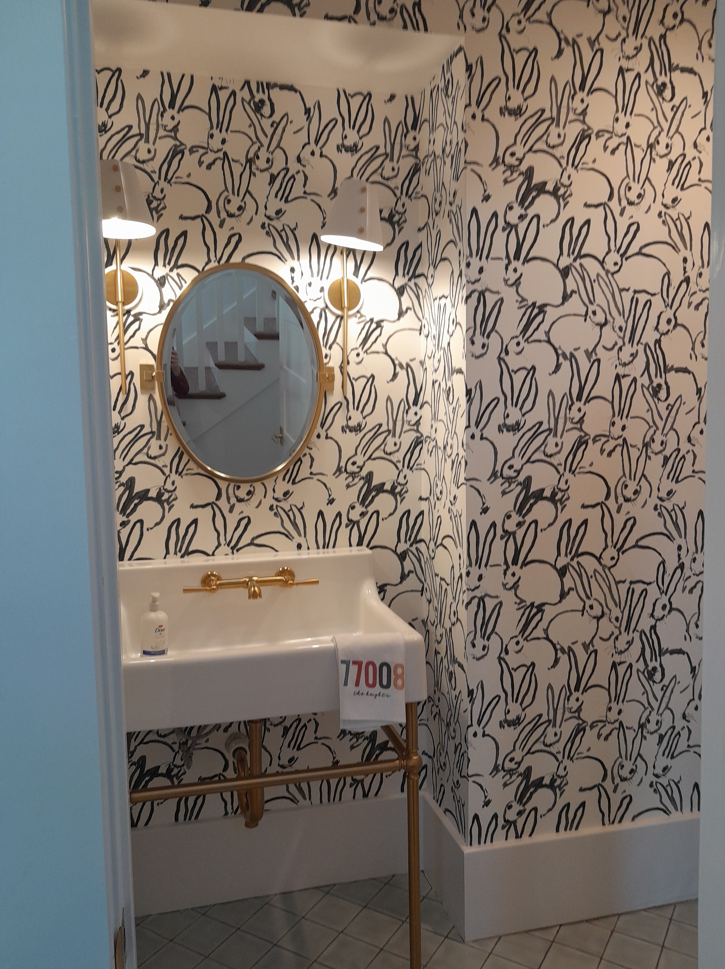
I saw this wallpaper in a powder room while taking the Houston Heights Home Tour last Sunday . This pattern was wildly popular about 10 years ago. Imagine squeezing under that console sink with metal legs to place the wallpaper under there.
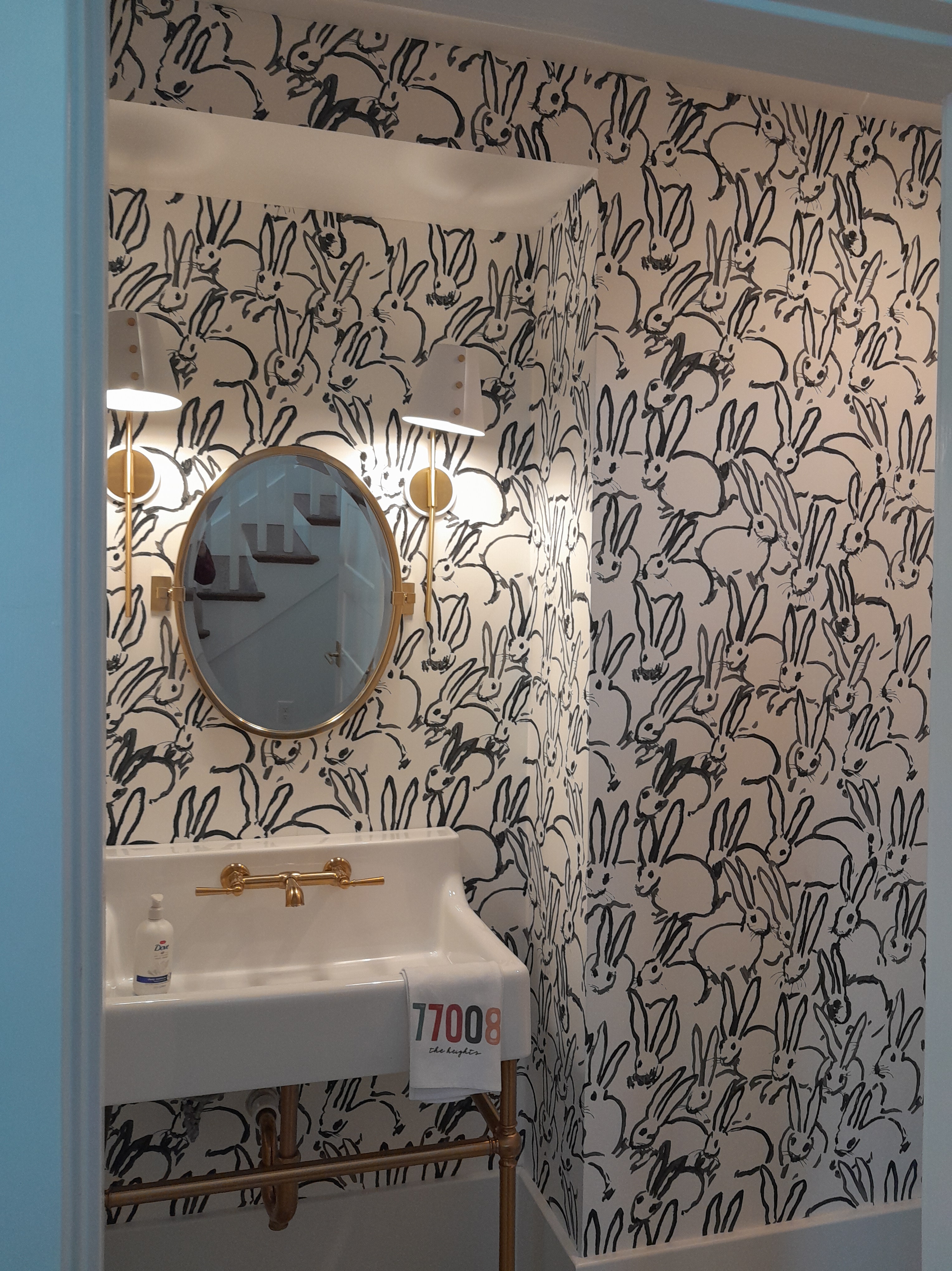
Another shot, showing a little more of the fir down / soffit over the sink . According to Wikipedia , the designer, Hunt Slonem , started developing his obsession with all things bunny in the early 1980’s . He’s produced lots of different incarnations, and they’ve been used in wallpaper , fabric , artwork , kitchenware , decorative items , and everything in between.
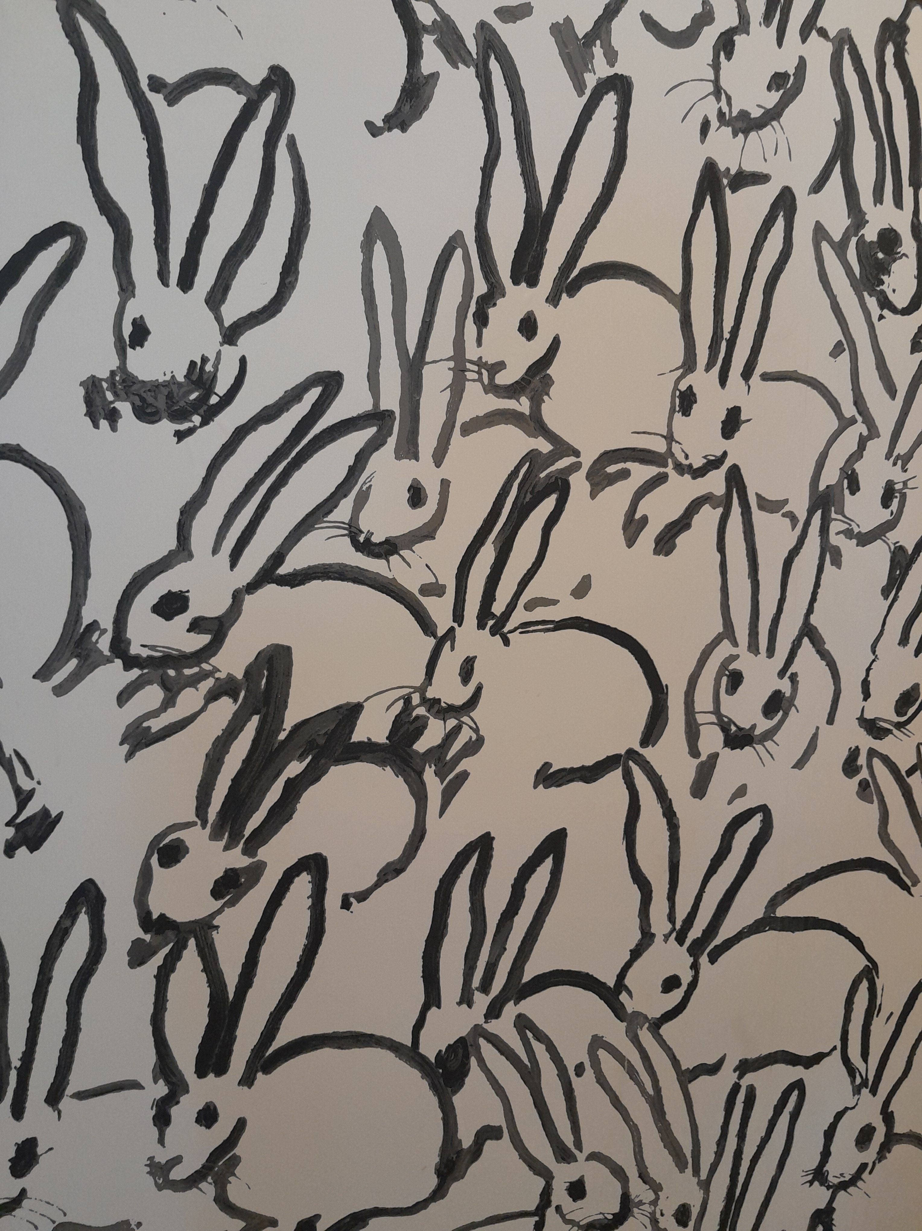
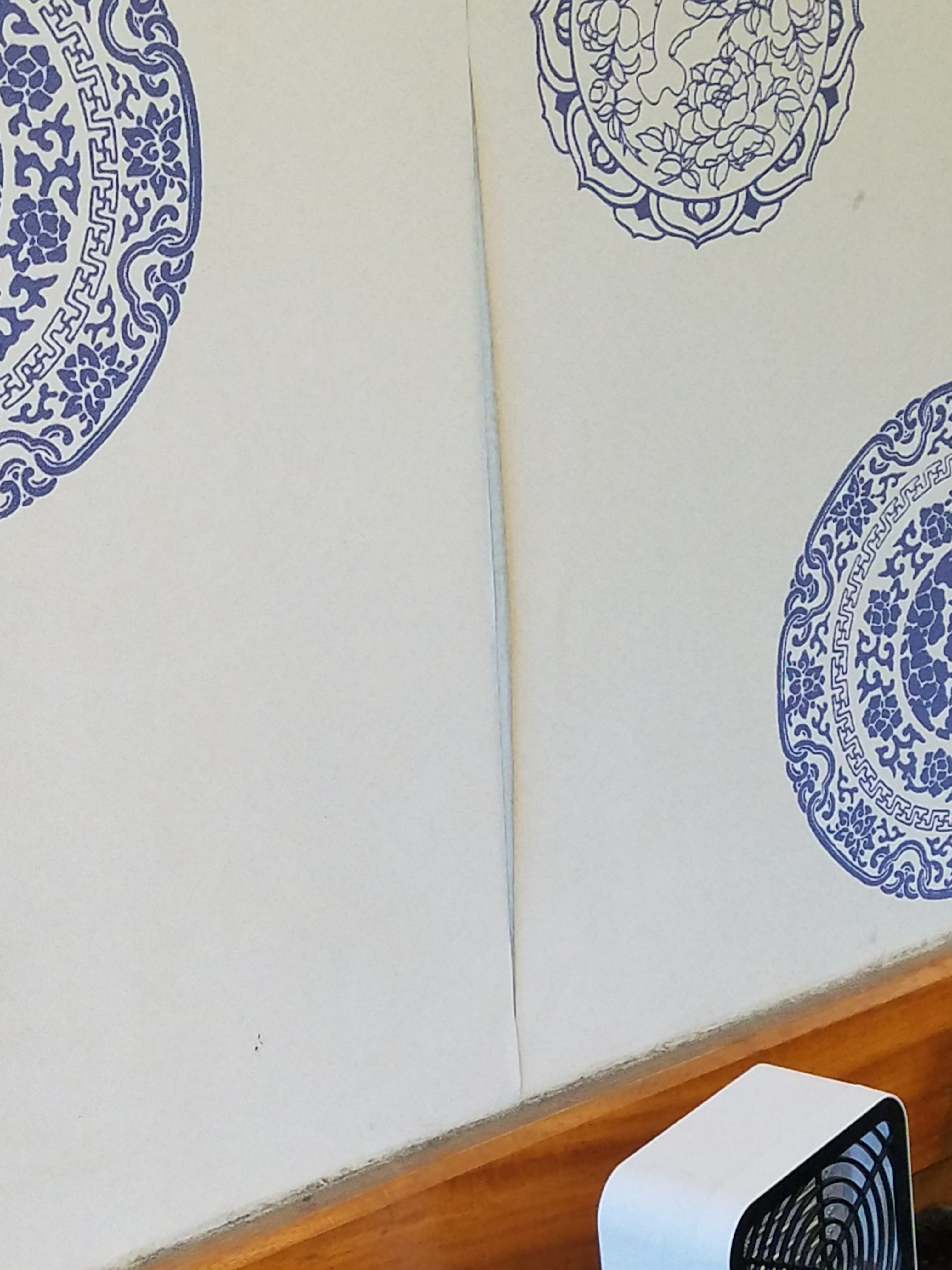
Such a fun pattern. “And they breed like – rabbits!” This wallpaper is notoriously difficult to install . More on that in a future post.
The homeowner totally loves this French style toile pattern on the bed in her guest bedroom . She hunted for a long time to find a wallpaper that would compliment in color and theme , for the bottom of the walls beneath the wainscoting .
Here’s the west wall, in the midst of prep work . More on that in a future blog post .
Here it is finished. A lot warmer . And you can see how the color of the wallpaper perfectly compliments the bed spread .
East side of the room. The homeowners have moved the furniture to the center of the room . Yet, note that I’ve only got about 2 1/2′ workspace along all four walls.
East wall done. It’s nice that I don’t have to get up on my ladder , nor haul in my work table. Because this is a paste the wall type of wallpaper, I could roll the material out on the floor to measure , and paste the wall rather than the back of the paper ). But … I gotta tell ya … fit as I am, spending the entire day on my knees, squeezed into that narrow space, I did end up with score muscles and an achy back. Moving on to other things … The homeowner smartly waited until the wallpaper was up, before choosing a paint color for the top portion of the walls. It will probably be a green , or possibly gold , but diluted and soft . On projects where there is a wainscoting dividing the wall sections, it works best to make the division at a 1/3 point, either from the floor or from the ceiling . Design-wise, you want to avoid dividing the wall in half. When selecting a paint or wallpaper color , I like the bottom portion to be darker than the top. That’s because, since the bottom part of the wall is lower , to me, it should be darker, i.e. visually heavier than the area above the wainscoting or chair rail . This photo is a good example of how well that works.
Close up. The design did have a pattern match . But I found that, from two feet away, it kinda surprised me, but it looked homogeneous whether it was matched or not . Not matching the design across the seams is what we call a random pattern match . It can save a lot of wallpaper, because, depending on the height of the walls and the length of the pattern repeat , matching the pattern can result in waste of a lot of wallpaper / square footage .
Here’s a close-up . I love that the background of the wallpaper has a fabric -like look to it, because this room also serves as a hobby / sewing room .
The manufacturer is Designer Wallcoverings . Non-woven materials like this are easier to install . And they are designed to strip off the wall easily and in one piece, with no / little damage to the wall when it’s time to redecorate .
Here is the paste-the-wall icon – although, since this picture somehow got turned sideways, and because WordPress makes it incredibly difficult to edit photos, in this shot, it looks like they’re telling us to paste the paper. Never fear … on a simple accent wall with no turns or obstacles to trim around, a DIY ‘er could easily take on this type of wallcovering . This wallpaper was purchased below retail through Dorota at the Sherwin-Williams in the Rice Village ( Houston ). She has 25+ years selling wallpaper and 300+ selection books – and she knows what’s in every one of them! So she can easily and quickly help you find your perfect pattern. Hours fluctuate, so call to make an appointment, and let her know what you’re searching for. (713) 529-6515 The home is in the Garden Oaks neighborhood of Houston .
Don’t miss the stripes on the wall outside the room … but the main event is the tropical foliage pattern in this small hall bathroom . Note how the installer centered the leaves on the window – the first wall you see when you open the door .
The homeowner bought this townhouse in central Houston 12 years ago and has always wanted to get rid of this really blah, ditsy small print in the commode room of her master bathroom . I know the design trend for the last several years has been white , grey , grayeige , minimalist , serene , clean , sparse ,,,, but there is nothing in this gal’s home that is remotely any of that … Her home is all about color , pattern , meaningful items prominently displayed – and lots of them! (Example: notice the fancy doorknob and the tassle hanging from it.) I really enjoyed working here, because that’s pretty much my decorating style , too.So here’s continuing that ” moody maximalism ” theme into the potty room. Note the cabinet and ceiling have been painted a coordinating color . Opposite corner . The room is REALLY tiny , and the door opens inward , so it was quite a bit of a challenge squeezing myself, my tools, and my ladder all in there. Close-up. The pattern is called Artemesia Absinthium , and is by Klaus Haapaniemi & Co in Finland . I don’t know who this Klaus guy is, and have never worked with his wallpaper before, but he must be half-high on psychedelics ,,, I would highly recommend a visit to his website and checking out the various fabric and wallpaper options . If you’re into maximalism and bold drama , that is! The material was a quite nice non-woven , and was easy to work with . I did stripe dark paint under where the seams would fall, in case of slight gaps showing the wall beneath . I was a little disappointed that there was some slight paneling / shading / difference in depth of color between some of the strips – but not too noticeable . Non-woven papers are designed to strip off the wall quickly and easily and with no / minimal damage to the wall when you redecorate . I do find it interesting that this pattern is so very similar in design and name to the very popular Artemis by House of Hackney , another good wallpaper manufacturer . Like I say, for every company making a cool pattern, there are others making their own versions / knock-offs .
Kinda bland, huh?Well, let me fix that for you! With just two colors and a simple, yet flowing design, this wallpaper pattern breathes life into this room – but doesn’t overwhelm. Pattern is nicely centered between the windows.This is another wall that also has two windows . I was able to center the pattern between these windows, too. Centering on two different walls in the same room is actually something of a feat – but that’s a story for another time. From a distance .This home has bull-nosed / rounded outside corners and edges, as well as the arch . Very tricky to get wallpaper trimmed to these areas neatly and evenly . See other posts for more info on this.Close up. The design has a weathered fabric texture sort of background . The copper colored foliage is lightly metallic , so has a slight shine – but only when viewed from certain angles , so it’s a subdued luster that’s added to the room . Note how the coppery color coordinates with the light fixtures / chandeliers . The wallpaper is by Graham & Brown , a good manufacturer with quality papers. The pattern is called Twining . This company makes nice non-woven papers , which have a polyester content which makes them stain-resistant and durable . They are also designed to strip off the wall easily and in one piece and with no damage to your walls when it’s time to redecorate . G&B ‘s materials are usually flexible and nice to work with – although this particular one did tend to drag and tear when being trimmed – even with a new blade. I usually paste the paper , but non-woven materials can also be installed by paste the wall . The home is in the Oak Forest / Garden Oaks / Heights neighborhood of Houston . This project took me three days, to smooth the textured walls , and then hang the paper around four walls , and trim around those pesky rounded edges and the arch .
Before. Good colors. But nothing inspiring. Done. Boy, this paper really visually pushed the walls away and made the room look larger ! Easy on the eye tone-on-tone pattern , lighter colors , and a teeny bit of gold sparkle .
Note the 5/8″ high strip of wallpaper under the medicine cabinet on the left.
Because those faucet handles sit up so high above the backsplash , it’s likely that when people reach for the handles, water will get splashed onto the wallpaper . To prevent splashed water from wicking up under the wallpaper – which could cause the paper to expand and curl away from the wall – I ran a bead of clear siliconized caulk along the top of the backsplash . The color is skewed in this shot, but you get an idea of the tropical foliage and pattern scale . Toile is a French word for a sort of pen and ink drawing in one color on a background that may be colored or may not be.Close-up , showing a truer color . Note the palm trees and the monkey . This material has a woven -look textured surface , and it mimics fabric . I almost felt like I was install ing linen , instead of wallpaper . The brand is Rasch , a company out of Germany . Their papers are consistently nice to work with. This one was unexpectedly thin and flexible . It’s textured vinyl on a non-woven substrate . The vinyl makes it durable and stain-resistant , and the NW makes it easy to remove later when you’re ready to redecorate . The seams are positively invisible. This powder room on the first floor just off the home office / study comes complete with a shower . Just for fun – one of the obstacles in this room was this rain shower head – sticking out right where I need to be on my ladder , and keeping me from reaching those walls . On top of that, the faucet handles also stuck out much further from the wall than most do. While priming the walls, as I was climbing down from the ladder , my clothing actually got entangled in the handles and – turned on the water ! Yes, I got a shower at work today ! The home is in the Woodland Heights neighborhood of Houston .
I love all things vintage , particularly the early 1900’s – 1940’s . So it was a thrill and an honor to help decorate this 1926 home in the Woodland Heights neighborhood of Houston . The homeowners revere their new abode , too, and carefully maintained the character of the home during the renovation, while still adding updates that facilitate life in a modern world . They also preserved many of the original features , and created a sort of ” shrine ” near the back door. This framed wallpaper sample is one of those.I love these old papers, and have a growing collection of my own. Back in the day, the ship-lapped walls were covered with cheesecloth – like fabric , which was tacked to the wood . The wallpaper was pasted and then applied over that. You can see some of that fabric peeking out at at the top of this sample . Just about every room had a border running around the top, below the ceiling , as seen in this example. This was stylish through many decades , so it’s difficult to tell what era this particular paper is from. To me, this looks like the 1950’s – but it could be as early as the 1920’s . Borders were still popular into the 1990’s , but wider. I’ve hung bunches of them! This ” history wall ” also included keys , mailbox parts , invoices written in fountain pen , hinges , and other cool old memorabilia .
Breakfast nook “before” is bright and airy – but washed out and uninspiring. The vertical tan lines are paint I’ve striped under where the seams will fall, to prevent the light colored primer from peeking through. “After” has warmth, life, and a cheery feel. With a little color contrast, now you can see the detailed woodwork and window molding. The paper has a bit of a tropical, thatched roof, Ernest Hemmingway, sort of feel. Note I’ve balanced / centered the pattern so it falls evenly and equally on either side of the window . Note how perfectly the motifs fill the space above the windows, as well as below the windows. It’s a minor thing that you don’t consciously notice, but it gives the room a grounded , balanced feeling . Another angle . The chandelier is a major feature in the room. I love the way the chunky beads repeat the color and theme of the white pattern in the wallpaper. Unlike most wallpapers that come in rolls of standard sizes , this material comes in continuous yardage on one huge (and HEAVY ) bolt . The height of the motifs perfectly fits the space between the window and the crown molding . No flower tops got chopped off in this room !There are five windows. This is the area between two of them, including an obtuse angle . It took a LONG time to get the paper around all five windows, keeping the pattern intact . Close-up showing the texture . This is a paperweave , which is similar to a grasscloth , as both are natural fibers and materials . Because this paper weave is woven, instead of having stiff, straight strands of grass crossing the wallpaper , it was a lot more flexible and workable than regular grasscloth .The space over the door molding was just 4 1/16″ high. The flower motif fit in here perfectly . You can see along the seam in the center of the photo , that some of the fibers may try to come off the backing , especially at seams and areas where you’ve cut into the material , such as trimming around window moldings and other obstacles . This is pretty minor . Overall, the seams are virtually invisible . One other thing I didn’t like about this paper is that, after the wallpaper was made, the color was applied to the front, like paint . This made the color subject to abrading or flaking off under even light rubbing . It would have been better IMO to have dyed the fibers and then sewn / glued them on to the paper backing . Then the color would go all the way through. Not a biggie – you just have to work slowly and carefully and gently. Oh, and you can’t get paste or water or fingerprints on the surface, either – because they can’t be washed off and can stain . The pattern is called Papavero and is by Casa Branca . The material has an unprinted selvedge edge that has to be trimmed off by hand, using a straightedge and razor blade . Takes a lot of extra time , and even more so because you have to press harder to get through the thick fibers than with a traditional wallpaper . A picture of my straightedge and razor blade . I’m trimming something else here (that will be blogged about later), but you get the idea . A really bad photo of a really perfect chandelier . It’s chunky , white , and the shape of the ‘beads’ repeat the flower motifs in the wallpaper. The windows will have Roman shades made of a somewhat coarse white linen type fabric , which will coordinate beautifully with the texture of the wallpaper . The home is in the Heights neighborhood of Houston .
Before. Primed and ready for wallpaper . Done. This image could be positioned so that the palm leaves push up from the floor , or, as in the photo , they hang down from the ceiling. This is a popular look right now, and very fitting to an accent / headboard wall in a bedroom . Done. The homeowner bought one mural from Russia before she and I consulted , so it would be difficult to get another. In addition, the mural images don’t continue from right to left, so you can’t place two murals next to each other and have palm leaves continue unbroken . The manufacturer’s picture on-line is misleading, too, because it’s been Photoshopped to look like it fills the whole wall with tropical fronds . As you can see, the actual mural is a lot narrower than the wall, plus shorter by about a foot and a half. The mural is placed slightly off-center on the wall , because the homeowner wanted it centered on the bed , which sits a little to the right of center . Plans are still incubating, but she’ll probably have wooden panels or trim placed on the wall flanking the mural as well as beneath it, to give a finished look. All in all, I think the room looks dreamy !Close-up .The material is vinyl and has a woven fabric – like texture . The mural came in four panels, each about 3′ wide by about 8.5′ high . Here I am laying them out so I can get measurements and to be sure they go up in the right sequence. There were a lot of these little black specks of a chalk – like substance on the back , and even some on one area of the front . Did I tell you this came from Russia ?! Sorry, no brand name, but this was thin and very flexible and pretty nice to work with . This is a popular design concept , and many companies are making similar patterns . Try RebelWalls.com , which is super quality and really good customer service, plus tons of designs and images to cover your walls .
While waiting for my order to be ready, I couldn’t help but notice problems …. Wallpaper starting to curl at the seams. Wallpaper twisting in corners as the building shifts and drywall moves. This is pretty common in Houston. Other signs of poorly maintained building and/or climate control issues. Seam curling back. I believe this to be a lower-end solid vinyl wallpaper on a gritty paper backing – one of my least preferred types. When the walls are not prepared correctly, and the paper is not hung properly, and when there is a lot of humidity (door left open, steam from kitchen getting into waiting area, A/C not running or turned off at night), humidity can enter into the seams and be wicked up by the paper backing. The paper expands and pushes away from the wall, causing the edges of the wallpaper to curl back. The next step is that the vinyl surface can actually delaminate (come apart) from the paper backing. This is pretty impossible to repair. At the very bottom, you can see the vinyl separating from the paper backing. The wallpaper has been wrapped around this outside corner, and a new piece of paper overlapped on top of it. When this is done, with vinyl material, you’re supposed to use special vinyl-over-vinyl ( VOV ) adhesive, because regular wallpaper paste isn’t formulated to adhere to vinyl / plastic . But even if the installer had used the correct adhesive, under humid conditions or with improper wall prep, the odds are that this wallpaper job will start to fail. Also note dirt along the ceiling, and along the chair rail in the previous photo. General lack of maintenance and I am really suspecting lack of climate control.The black smudges appear to be mildew coming from underneath the paper. Again, probably related to humidity. Vinyl wallpaper is a sheet of plastic, and moisture can be trapped behind it. That can be a breeding ground for mold and mildew. So why use vinyl wallpaper? Mainly because the surface is much more washable than most other types of wallpaper. In a business, washability is attractive. But these property owners chose a low-end vinyl product, most likely skipped proper wall prep such as a wallpaper primer, and have not provided a hospitable environment for the paper. There are other vinyl wallcoverings that would have held up better. For instance, vinyl on a scrim ( woven fabric ) backing, or the newer backing called non-woven , which has a 20% polyester content, and therefore less likely to wick up humidity.