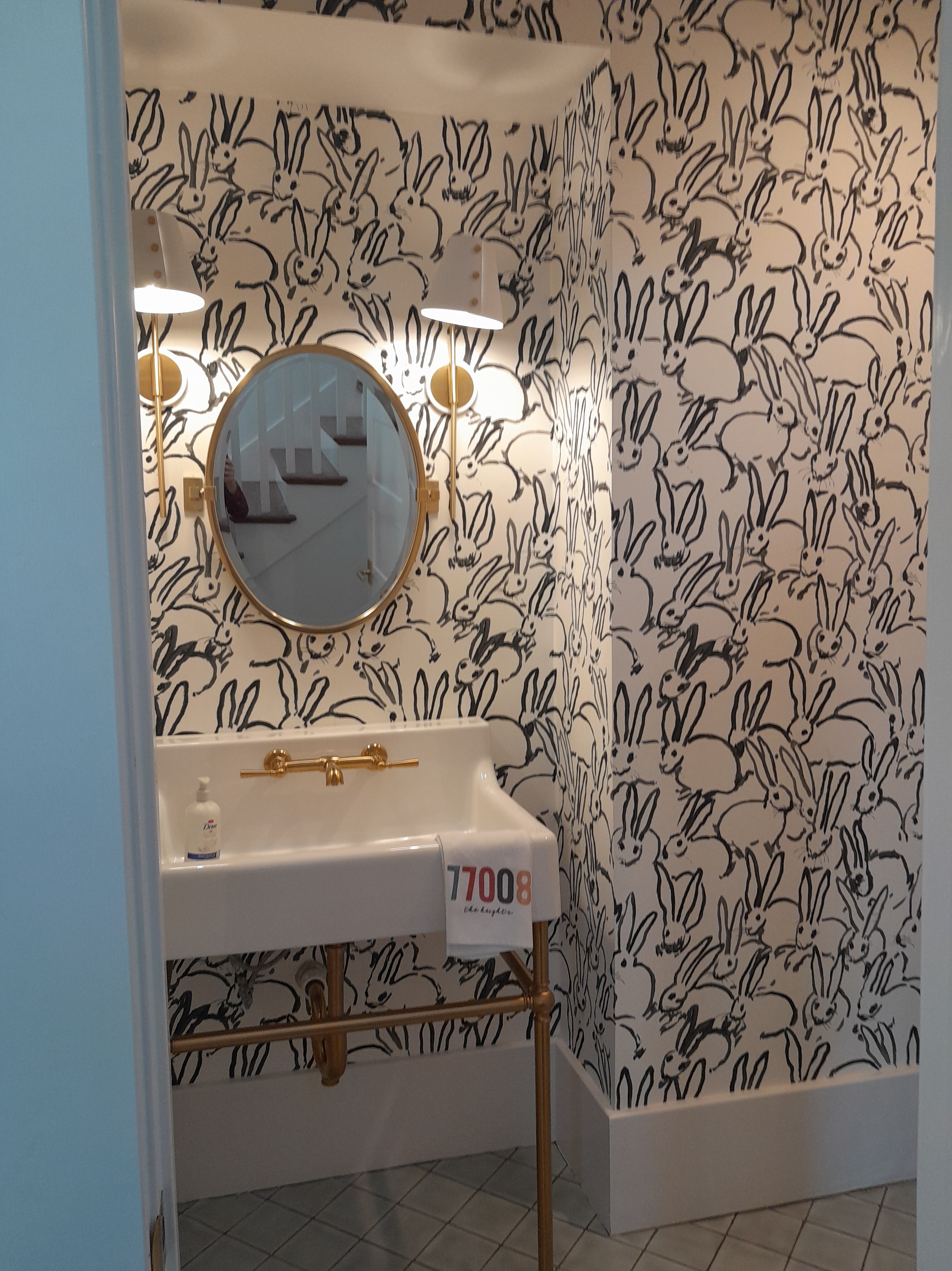
I saw this wallpaper in a powder room while taking the Houston Heights Home Tour last Sunday . This pattern was wildly popular about 10 years ago. Imagine squeezing under that console sink with metal legs to place the wallpaper under there.
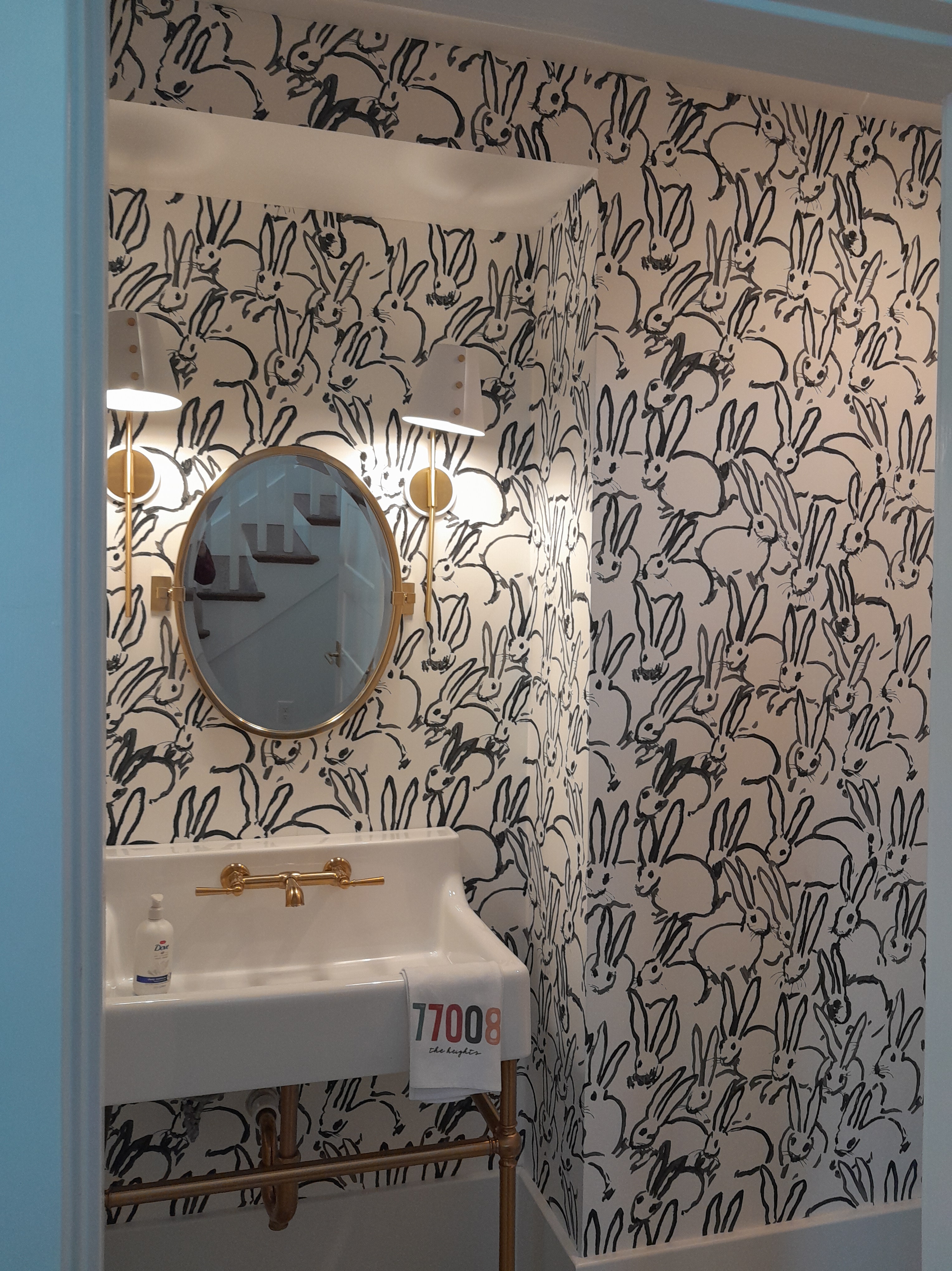
Another shot, showing a little more of the fir down / soffit over the sink . According to Wikipedia , the designer, Hunt Slonem , started developing his obsession with all things bunny in the early 1980’s . He’s produced lots of different incarnations, and they’ve been used in wallpaper , fabric , artwork , kitchenware , decorative items , and everything in between.
Such a fun pattern. “And they breed like – rabbits!” This wallpaper is notoriously difficult to install . More on that in a future post.
Looking from the home office into this small bar area that’s been carved out under the stairs .
Done. We discussed, and agreed that the busy pattern on that sloped ceiling part over the sink would be too hectic and dark and oppressive. But looking at it now, I think that it cries out for something – I suggested painting it orange or red – a color match pulled from the wallpaper motifs .
This room had a lot of turns and angles . Fun for the math and plotting , but really slows down the installation . And not to mention dimensions of the walls that worked out horribly with those of the wallpaper. Or seams landing in inopportune spots. So I would end up having to work in a 1″ wide strip of wallpaper. Or, in one case, a strip that tapered down to – no kidding – 1/16″ . !!
The walls and woodwork / trim in the adjoining home office are painted a deep, rich teal green . The homeowner said that everyone who comes in loves it, and compliments on the snug feeling of the room . I really like the way the artwork over the bar coordinates with the wallpaper .| Speaking of which, the colors in these photos are really off. The paper is not predominately orange and olive . In real life, this pattern is a lovely combination of a deep , rich teal , a few other greens, and then orange and red .
Look closely, and you’ll see all kinds of fun stuff – lizards / chameleons in top hats, parrots with crowns and collars , mushrooms , foliage , pocket watch .
A lemur with a monocle , toucan in a tux , and lots more unexpected surprises!
It’s a good thing that I’m small and skinny – I was able to squeeze myself onto the countertop and into this alcove . The paper is by PrimeWalls.com and is called Utopia . It has a metallic finish . It’s a non-woven material , so it’s easier to work with than other types of wallpaper . Also stain-resistant , and easy to remove when it’s time to redecorate .Can be hung by pasting the wall . The home is in the Medical Center / Old Braeswood / Boulevard Oaks area of central Houston .
I’m always happy when a national magazine displays wallpaper in its feature articles. BH&G frequently does. This is the Jan/Feb 2024 issue.
The dining room walls are covered in grasscloth , by Schumacher , and the design is called Acanthus . I’ve hung it a few times – including a dining room!
I love this bedroom , and I love the wall treatment . I’ve hung this one many times, too. This is called Chinoiserie Chic , and is a mural , rather than a typical pattern with repeating motifs. Interesting treatment on the ceiling , with the green stripes .
The brand is RebelWalls.com . It’s an affordable alternative to the hand-painted silk murals imported from China . These murals are custom-sized to your walls, and I really like their quality , as well as customer service.
Sweet toile in a nursery . This one I’m not so fond of. Overdone in the blue, to my taste.
And too much going between the walls and on the ceiling . I’m also not crazy about colored woodwork , preferring a soft white. What do you think?
I like the idea of covering the lampshade with the wallpaper . But I would display it against a solid color background. Or paint the whole shade blue, so it stands out, rather than disappears.
Bedroom walls covered in grasscloth , which gives a nice textured and earthy feel. Note that the seams are visible because it’s typical for grasscloth to be faded at the edges . You can also see color differences between the panels , as some are darker and some are lighter . Again, this is to be expected with grasscloth , a natural material . While I like hanging / installing grasscloth, because there’s a lot of math and engineering , I find that very often, the final outcome is disappointing .
OK, I’m a ” maximalist ,” and I have a high tolerance for visual activity and a lot of decorative “stuff” in a room. But I’m finding all this too much. I would display the artwork against a solid colored wall, and maybe remove one or two of the items on the shelf below. On the positive side, though, I will say that I’m trilled to see a step away from the current trend of all-white or all-grey , bare , minimalist decorating style .
Now, this one I like a lot. The pattern is called Nuvolette and is by Cole & Son in the Fornasetti collection. It’s very popular , and I’ve hung it a number of times and have it coming up again soon. This is a very strong design , and can easily overwhelm a space , when you see those storm clouds repeating and rolling across the wall(s) over and over again . But here, with the bed covering a large chunk of the pattern , and just part of the powerful clouds crossing the wall , I find this spellbinding .
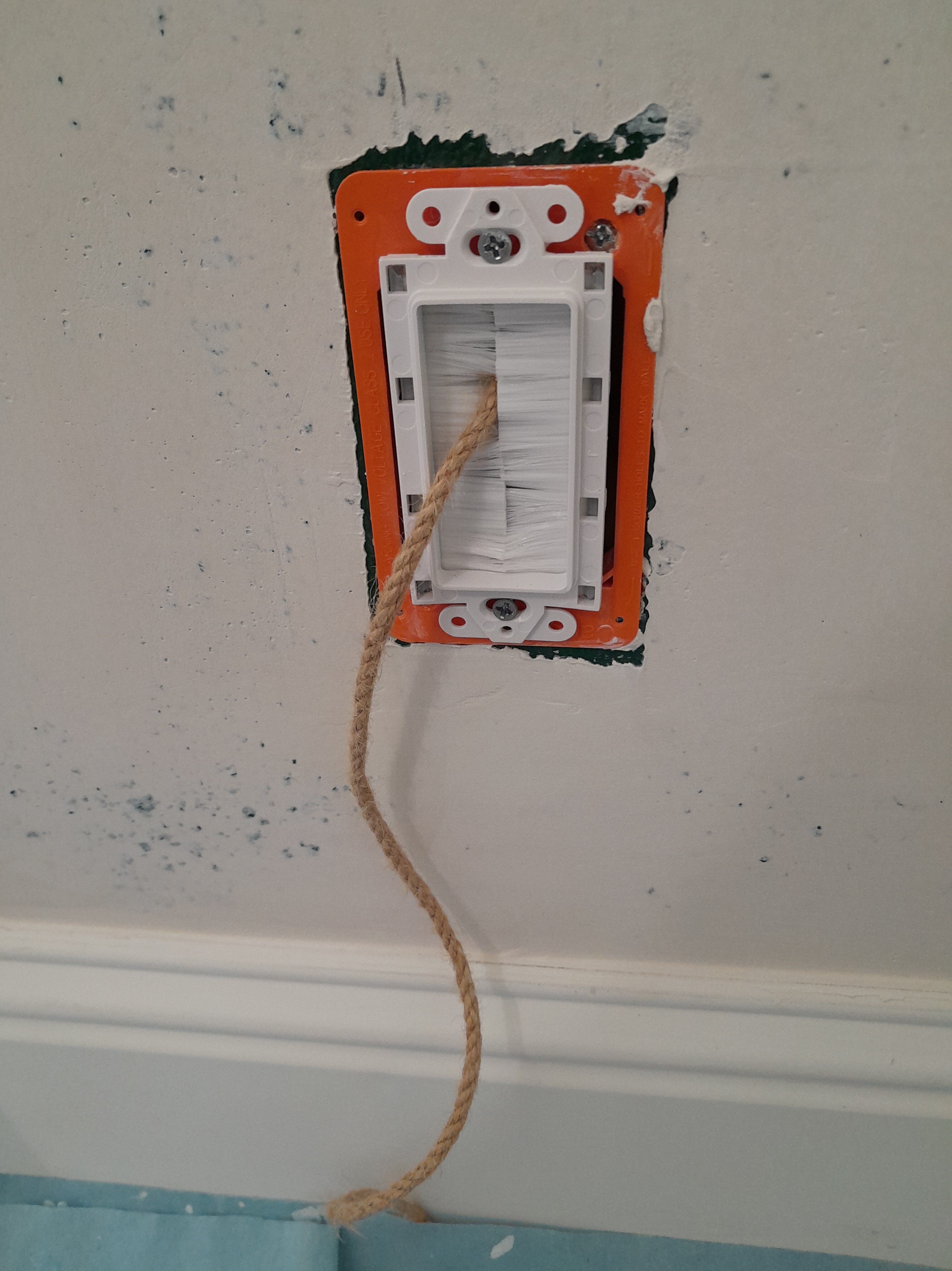
Once I get the wallpaper up on this accent wall , a large, lighted piece of art will hang on this wall. That orange rectangle in the middle is the junction box for the cable that will supply power to the fixture . There’s another one directly below it, near the floor . This cable hanging down along the wall would get in the way of me working with the wallpaper. And get covered in paste . So the homeowner has stuffed it back into the wall.
But if the wire is hanging down inside the wall, how’re we gonna access it when it’s time to reconnect it to the artwork? The clever homeowner thought to attach a piece of rope to the cable. Once the decorating is finished, he can easily pull the rope and fish the cable back out to the surface.
But the rope was still in my way. So I curled it up and stuck part of it inside the junction box. installer houston
Textured wall has been skim-floated , sanded smooth , primed , and is now ready for wallpaper . The homeowner has been planning this project for a couple of years, considering patterns , scouting out alternatives , factoring in schedule and budget . Finally went with her heart and opted for her first choice …
Rather than regular wallpaper with a repeating pattern , this is a mural , which has one pictorial design spread over four panels . What’s super cool about this one is the way the flowers taper off at the top, just as they would in a real field in the country. They fill the space so perfectly above the bank of windows . And the flowers look so nice with greenery right outside the windows . It took three 4-panel sets to fit the width of this wall.
The panels are printed in one continuous strip , so you have to cut them apart.
Here’s a diagram from the manufacturer , telling you how to cut the panels apart. They also suggest rolling the strips backward. This is a helpful tip. This reduces / eliminates the memory of the paper wanting to stay rolled up tightly, and makes it easier to work with. Also, since this is a paste-the-wall material, if you’re going to install using that method, having the goods rolled with the back side facing out, keeps paste on the wall from getting onto the face of the paper as you take it to the wall and work into position. This is also when you’ll double check and fiddle with the dimensions of the mural and wall. This mural was printed nearly 10′ tall, but our wallspace was only about 8′ tall. That means I had to decide how much to cut off, and whether from top or bottom – or a little from both. In this case, since we wanted those thinning flower tops at the highest point of the wall, I took off the excess 2′ from the bottom of the panels. The homeowner might use those scraps for lining drawers or cabinets, or for framing as artwork to use in other parts of the room. I really like the idea of pulling the design and colors onto blank white walls on other sides of the room.
More cutting the strips / panels apart. The four panels are printed head-to-head and toe-to-toe, so you’ll want to get them apart and then make sure that they are all coming off the roll in the way you want (head first or foot first). The design looks like it was hand-drawn by an artist using pastel chalk .
Here is my first set of four panels cut apart and rolled backward to reduce the curl . I hold them in place with elastic hairbands from the “health and beauty” section of the dollar store . Getting ready to do the same with the second set of four panels .
The pattern is called Floribunda . The photo shows one set of four panels .
The brand is House of Hackney , and I like this outfit a lot. The homeowner gets a whole lot of things from Anthropologie , and on-line site, so this may well have been purchased there, too. It’s a durable, stain-resistant non-woven material, which is relatively easy to hang, and which will strip off the wall easily and in one piece when you redecorate , with no damage to the wall. It can be hung by pasting the wall, but I usually prefer to paste the paper . The home is in the Heights neighborhood of Houston .
Eeek! A piece of artwork fell, and the corner of the frame banged into this wallpaper (which I put up only about two years ago ☹ )
Here are some suggestions from colleagues of mine on our Wallcovering Installers Association Facebook page.
Mr. Clean white sponge
Magic eraser
I usually try a microfiber towel over my index finger and some water and gently rub first. After that , maybe some hand sanitizer, (some are stronger than others depending on alcohol content)
If it’s from an aluminum frame, I like a gentle scrub with Bon Ami.
Pentel Hi-Polymer Eraser, White (ZEH10) | at Staples Office Supply Toothpaste gently. The white ones. Test first on a scrap. Wedding ring will sometimes leave marks, toothpaste seems to always work.
Any of those ideas – TEST FIRST on a scrap of left over paper. (another good reason to always buy a little extra, and to store the remnants)
Those ideas above are for removing , or at least lessening , the stain . If that won’t work, covering it is an option.
Hobby stores sell small bottles of craft paint . You could buy a few and mix colors at home until you get a good match . Remember that paint changes color as it dries, so test on a scrap and use a hair dryer or heat gun to speed dry time.
Another idea is to get Sherwin-Williams to do a color match in a small can of matt finish paint
Also, I could cut a small square from the left over paper and simply appliqué it on top. You would see a slight raised edge of the paper. But that would look better than the grey mark. You’d never notice it from 4’ away.
This is cozy, but bright, recessed nook, which is used for reading. It’s on the far side of a large room that’s used as a library, which you’ll see in other posts here. The opposite wall vaults up to 13′ or 14′. Wallpaper went on that tall wall, and also in this nook, with the other walls being painted a dark green. The same wallpaper was used on both walls, uniting the room.
Here’s the nook finished. I love the way the foliage and natural theme sync with the view out the window and into the yard.
Look closely – can you find the critters? Wall light sconce back in place. The color and pattern in the wallpaper really set off the windows, and play off the view outside. Lizards , frogs , bugs , and all sorts of leaves and flowers and vines .
The paper appears to have a linen – like textured background. But that’s not really 3-D … it’s all part of the printed design .
These homeowners are adventurous , and love color , artwork , and a little of the irreverent unexpected. These paintings are in the adjoining living room.
Ties together so well with the colors and motifs in the wallpaper just through the doorway!
The pattern is called Rainforest , and is by York , one of my favorite brands. It’s on a non-woven substrate, which is simpler to hang than most traditional papers. Also, it’s designed to strip off the wall easily and with no damage to your wall when it’s time to redecorate. This was purchased through Dorota at the Sherwin-Williams in the Rice Village of Houston , and helped these homeowners zero in on wallpaper with … lizards (!) to sync with their artwork. She’s a huge help in tracking down your perfect wallpaper pattern, and at discounted prices. Wed – Sat. Call first. (713) 529-6515. installer
Before. Textured wall will be smoothed and primed . Here I’m applying primer to the glossy wall , so the smoothing compound will adhere . Done.
Classic and elegant, this has all the traditional features – birds , butterflies , blooms , branches , aqua-blue sky , and critters running along the bottom ground portion . Chinoiserie means Oriental in theme and feel.
This was a 5-panel mural , but came in one long roll . It also has an un-trimmed selvedge edge that has to be trimmed off by hand . That’s the white border you see on either side. Here I am on the floor in an adjoining room (homeowner kindly removed the furniture so I’d have space to do this) rolling the material out . I’m using a scissors to separate the five panels , and also to roughly remove the excess material on either side of the panels . The panels will be trimmed more precisely while on my table , with a 76″ long straightedge and single edge razor blades . Dang – forgot to get pics!
Lining the panels up next to each other, to ensure sequence of placement . And to be sure the pattern match is correct. And to check measurements . The panels came 10′ high, and the wall was a little less than 9′. That meant that we’d have to lose about a foot of length . I chose to trim off more from the top, which was mostly blank blue sky . This left us most of the green portion at the bottom, with its hills and partridges and pheasants . On the upper right, you see I’ve trimmed off the top 6.5″ of material . This makes the strip shorter , and thus easier to handle when going to the wall . And also reduces the area that will overhang the crown molding at the top of the wall – so less paste gets slopped around and less paste to wipe off . Murals come in panels of one design per panel . Meaning, if something gets screwed up , there is no other panel to use . And, unlike traditional rolled goods , there is no repetitive pattern to roll off and use to start a new strip . Believe me, before cutting off that top 6.5″ , I did a lot of measuring and calculating and plotting. As the saying goes: ” Measure twice , cut once .”
Finished view with more light than in previous photo .
This is the first time I’ve hung this brand , and the material was unfamiliar to me. To be honest, the substrate and surface felt a bit odd to me. So I used one of those cut-off tops of the panels to paste and hang a test strip . It went up OK . But 10 minutes later , I looked at it and there was a large bubble . Small bubbles you can expect to disappear as the paper dries . But this was a pretty large (3″ round) bubble. It was easy enough to use a razor blade to pop a hole for air to escape, and then use a squeegee tool to chase it out. But it was indicative of what was to come, because when I got to installing the actual strips / panels , most of them developed large bubbles , too. Needless to say, I wasn’t crazy about this material / brand .
Finished wall, again. The mural came in maybe 10-12 panels . You could choose which panels you wanted (as long as they were in sequence , to ensure the pattern matched across the panels ). The homeowner liked the flowers and birds , as well as the height of the pattern , on certain panels. So she chose panels #6 – #10. This worked out beautifully for this wall area . For one thing, the branches arch to the right and then to the left , and meet pretty much at the top center of the wall. This makes for a nicely framed and centered image . Note that the fifth panel (#10) on the far right, is over the door. So about 2′ was used over the door, and about 7′ of the bottom portion got cut off. Usually this just goes into the trash . But the homeowner had the idea of framing this scrap as artwork and hanging on an adjoining or nearby wall . This is a fabulous idea, as it will repeat the colors and theme of the dining room accent wall into other, nearby, area(s) of the house. As well as keep that unused 7′ length of paper out of the trash pile . Close up .
Note how the artists recreated the look of actual hand-painted and hand-sewn silk mural panels , by including the illusion of squares of silk sewn together. The “real deal” murals by the likes of de Gournay and Gracie and Fromental can cost as much as $2,000 per panel . Just for the material. Tons more for installation .
The brand is Mural Source . The pattern is called Belva in the Spring colorway . As mentioned, I wasn’t crazy about the vinyl material or the backing / substrate . The vinyl was thick and flexible . ‘Flexible’ sounds good , but in this case, it meant stretching and warping . And the backing, which was supposedly non-woven , and which the mfgr advised could be hung by pasting the wall , stretched and expanded … oh, and let’s not forget those large bubbles . Also, with panels being 37″ wide, it was difficult to position the strips , match the pattern , and work out the warps and wrinkles . There are plenty of other companies making similar designs that are of better (IMO) material content . And that don’t require the tedious and painstaking hand-trimming of the edges – 1080″ at last count! (1.7% of a mile – I couldn’t resist ‘doing the math’!) RebelWalls.com is one company that I like a lot. But, in the end, the wall looks great and the homeowner is thrilled. It adds a whole new dimension of elegance and classic feel to a fairly modern home with a young family with three kids under 10.
Well, after so many all-white-with-a-few-touches-of-grey homes, how’d’jou like to step through the front door and into this? Me, I LOVE it! Previously, the entry focal wall was stenciled with a geometric pattern. It was expertly done. But the family wanted something more energetic.Well, here it is – they got it! The family has FOUR boys , grade school-aged and younger. Go, go, go! This bright and perky pattern is the perfect backdrop for the lively home. This wall faces opposite the entry door, and leads to the family room – the hub of activity for this non-stop family . Close-up. Looks like it was created free-hand with a wide artist’s brush and tepera paint . Oh, and then the drips … Artwork in the adjoining home office coordinates perfectly with the colors in the wallpaper . This wasn’t planned, but was a wonderful langinappe . The pattern is called Crossroads and is by Milton & King .
It’s a non-woven , paste the wall material , and was lovely to work with. Thin and flexible, yet strong and durable . No creasing , resistant to stains , and will strip off the wall easily and in one piece when it’s time to redecorate . I like this brand a lot. They have really innovative patterns, too. Do a Search here to see my previous installs of Milton and King . M&K is a little different from most wallpaper companies, because it (usually) comes as a sort of mural , in 3-panel sets . So it’s tricky to measure for, and also takes a different mind-set during installation . The material is 24″ wide, contrasted to most wallpapers, which are 20.5″ or 27″ wide. The panels come nearly 10′ high (these were actually longer), and these walls were just a tad over 9′ , so you have to plot how much to cut off and from what end. With the 3-panel set (which they call a ” roll “) you’ll have a Panel 1, Panel 2, and Panel 3. When hanging the paper , you have to keep the panels in their proper sequence . Since I started on the door wall so I could center the pattern over the window lites , to hang wallpaper on the other two walls, I was working from left to right , and then on the other wall I was going from right to left. This meant that, first, on the wall to the right, my strips were going from Panel 1, to Panel 2, to Panel 3. But on the wall to the left, the panels were going from Panel 3, to Panel 2, to Panel 1. Confused yet? Add to that the fact that the strips above the door were Panels 1 and 2. That means that the wall on the right, the first full-length strip, wasn’t starting with 1, but with 3. Then moving to 1. Then to 2 and then 3. But the wall on the left was moving in the opposite direction, and starting with 3. Then 2, then 1. Then 3. Double confused yet? See? THIS is when and why you want to call in a professional! 🙂
Another nice thing about M&K is their packaging . They wrap each roll ( 3-panel set ) in its own cushioned box . Each of those boxes goes into a perfectly-sized shipping box. Their paper always arrives undamaged , and with no banged edges , and perfectly intact . The empty boxes can be used to store any leftovers. Or can be broken down and tossed into the recycling bin . A good company, all the way around. Oh, and – did I mention … they’re based in Texas ( Dallas )!! This home is in the Timbergrove / Heights neighborhood of Houston
The hallway leading to bedrooms in this 1960 home in the Hedwig Village area of Houston. Primed and ready for wallpaper .
This is a sort of gallery room, because the walls will be covered with family photos, as well as artwork. As a backdrop, the homeowner wanted something more durable and warmer in feeling than the plain old paint they had lived with for 20 years, but not a busy pattern, so as to keep the focus on the artwork and photos, not the wallpaper . She also wanted something washable and resistant to stains and dings from people and pets passing through the hall.
Finished. The homeowner loves the look and the simplicity . The light texture adds warmth . I didn’t think I was going to like the dull purple color against the honey-hued natural wood tone of the moldings and doors in this room. But as the wallpaper started going up, I began loving it more and more. Close-up. This is a textured vinyl surface bonded on to a non-woven backing . With silver metallic accents. Thank goodness it’s a random pattern match, so you don’t have to go hunting for just the exact silver lines to match from one strip to the next. This wallpaper is by York .
Vinyl is durable and stain-resistant all by itself. But this one is printed on a non-woven backing / substrate , which makes it easy to strip off in one piece and with no damage to the wall when redecorating years from now. The home is in the Memorial Villages / Hedwig / Hunter’s Creek area of Houston .