The nursery before. I have skim-floated and sanded the textured walls to smooth them, primed , and now it’s ready for wallpaper .
Not your average baby’s powder blue or teddy bears ! Mom saw the look and fell in love with it. Here’s how the manufacturer’s website described it: “Channel the spirit of the Scottish Highlands with our take on iconic tartan plaid.”
Big screen TV will go on this wall.
The mom recreated everything she had seen in her inspiration photos , including the black crib and dresser / changing table .
The pattern is called Equestrian Plaid . The parents are debating over finishing touches that lean toward a horse or racing theme , or a ” to the hunt ” look.
I’ve hung plenty of the Mind The Gap brand before, but this is the first time for their Complimentary line. It’s packaged in rolls rather than their usual panels , and has a repeating pattern , so you might get a little extra paper , like short left over ends that can be used over doors . Like their other lines, this is a non-woven material and can be hung by the paste the wall method . And it will strip off the wall easily and with no / little damage to the wall when you redecorate down the road. It’s nice stuff.
Oh, and each roll / bolt comes wrapped up in its own individual box, complete with satin ribbon. Snazzy! The home is in the greater Heights area of Houston . Read future posts for more on this install .
While these days it’s popular to do a single accent / feature wall in a nursery, this mom envisioned all four walls papered. With this soft and all-over pattern , it’s a very easy look.
The blue trim paint really punches up the look. But blue paint on the crown molding would have been heavy, like a dark stripe in the sky, and would have visually dropped the ceiling down on us.
The parents waited to learn the gender of the baby until birth. Mom had selected two options, one for boy and one for girl. Once the child was born, there was a mad dash to order the chosen paper and get it shipped here in time for the installation . Indeed – the paper arrived on the second day of this 3-day job. (Luckily, the first day was all prep.)
Mom had been fiddling on-line (good old Pintrest !), and found a pattern by Flat Vernacular that she liked. But that is an expensive brand, and special installation techniques are needed,,, so the price was ticking upward, especially when doing all four walls. I suggested she visit Dorota at the Sherwin-Williams in the Rice Village , and get her expert help in finding an alternative . (call first (713) 529-6515 for appointment) My client loved working with Dorota, and was thrilled with this very similar wallpaper pattern by York , on a durable non-woven backing, and very affordable price .
This is called Wildflower Sprigs .
The home is in the Heights neighborhood of Houston .
The blue cabinets added a cottage feel, but the homeowner wanted more character and warmth. As a side note, I hung wallpaper in this kitchen back in the ’90’s. A few years ago, when they updated, the cabinets were painted blue , the paper was removed, and the backsplash area was painted white. The homeowner liked the new look – but she always yearned for the warmth of wallpaper. Last year, I wallpapered two walls in the adjoining great room / family room . Now the homeowner wants to bring that pattern and color around and into the kitchen backsplash area. Didn’t get a photo of the family room .
So here it is finished. It’s just so much perkier!Close up. Even though the backsplash was originally painted white , the wallpaper makes the room so much brighter .Sink and window wall .
The refrigerator is heavy , plus there isn’t much space for it to roll out of its niche without hitting the island. So the homeowners didn’t want it moved. We agreed to put the paper just around the appliance, rather than all the way on the wall behind it. Without moving the refrigerator. Yes, I was able to squeeze around, along, up, over, and down, and got wallpaper into the 2″ wide (narrow!) space next to the ‘fridge , all the way down to the baseboard. And also on the wall above it, which was tricky, because this is a really deep refrigerator and hard to lean over it and reach the back wall.
To match the opposite wall , which I had papered last year, the homeowner and I decided it would look good to have this final wall in the family room papered, too. (Originally it was painted a pretty spring green .) There isn’t a lot of wall space, but you can see the pattern creeping along the top of the windows , in that space just 2 3/8″ high . There’s also a narrow strip coming down between the window and the bookshelves , on the left side of the photo. Just these little bits of pattern stand out against the white woodwork , and also make the whole room cohesive, because now that pattern is on three walls. The backs of the bookcases will remain painted green.
Pattern nicely centered , behind the antique clock .
The pattern is called Bramble , and is by Rifle Paper , a company that’s becoming very popular . Most of their patterns are cheerful and playful . The material is what we call a non-woven / paste the wall . It’s nice to work with , durable, somewhat stain-resistant , and is designed to strip off the wall easily and with no damage to the wall when it’s time to redecorate. The home is in the Bellaire area of Houston installer
Accent wall before. Wall texture was skim-floated and sanded smooth , then sealed and primed with Gardz .
Here it is with wallpaper !Larger shot.
From a distance, the ceiling line is probably the most noticeable feature of this wall. Because the ceiling isn’t level , I knew that if I hung my wallpaper true to plumb (along a plumb line ), the checks would start tracking up or down ( going crooked ) as they moved across the wall, and wouldn’t run straight below the ceiling . So I decided to railroad the wallpaper. This means that instead of hanging the strips vertically as is usually done, I hung it horizontally . This made for long strips – more than 16′ I wanted the solid blue line along the ceiling, so I used a razor blade and straightedge to trim off the line of white half-squares that was along the edge of the paper. In the photo above, if you look at the bottom of the strip that’s on the wall, you can see what I’m talking about.
A 16′ long strip of wallpaper , that’s wet with paste , is awkward and heavy for a sole lil’ gal like me to work with. One trick is , instead of booking the paper in two sections as usual (do a Search here to learn more), I fold the pasted material in accordion pleats, as you see above.
Then when you’re unbooking the paper, you’re manipulating shorter lengths at a time. Working between two ladders as in the 4th photo helps, too, because I can step from one ladder to the next without taking my hands off the paper. Also note that I’ve used a push pin to hold the paper to the wall when I need to climb down and move the ladder s .
Close-up.Closer-up.
This material had a non-woven backing , and could be hung by the paste the wall installation method . But I usually prefer to paste the paper . This had a vinyl surface, which I’m not crazy about, but overall, it was a nice paper.
The pattern is called Picnic and is by Hovia , a European company. The home is a new build and is in the Garden Oaks / Oak Forest area of Houston .
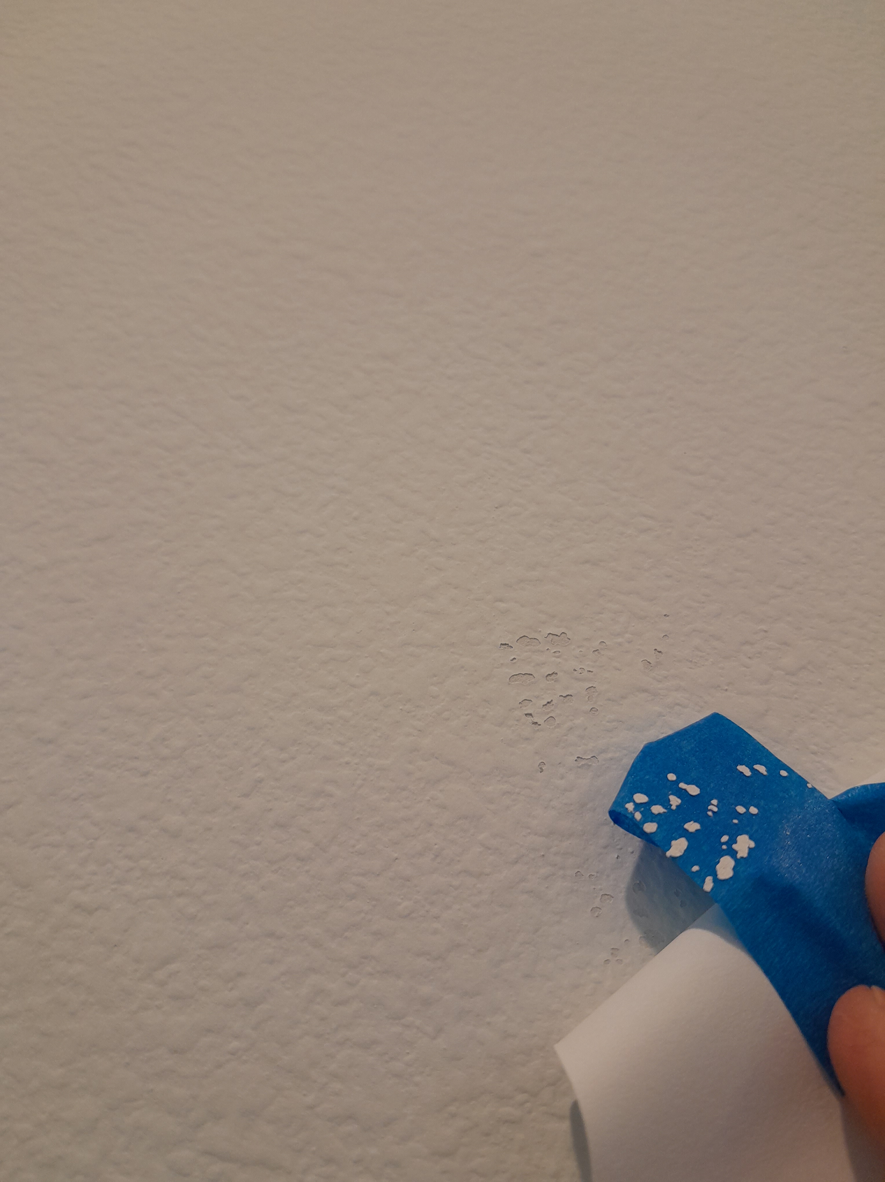
The homeowner has used blue painter’s tape to stick a sample of blue gingham checked wallpaper onto the accent wall of this baby boy ‘s nursery .
Uh-oh! Removing the sample and the tape has pulled bits of paint away from the wall .
Here you can see where the paint has pulled away . This is a new home, so there’s no other paint underneath there. So the grey is either primer or the bare drywall / Sheetrock .
Or dust. It’s possible / likely that construction dust was not wiped off the walls before the primer and paint were applied .
Nothing sticks to dust . So just the tug of ” removeable ” painter’s tape is enough to cause the top coat / paint to come off the wall .
Across the hall, another wallpaper sample taped to the wall in the toddler girl ‘s bedroom .
Same issue here.
Why is this important? If these various layers of coatings don’t adhere well to each other, you have an unstable wall surface , and the potential for delaminating surfaces – which means, the surfaces can come apart. Not a big deal with paint. Paint dries and just sits on top of the wall. But wallpaper is different. Because most wallpapers shrink as the paste dries , and that shrinking can put tension / torque on the seams , and that tension can be enough to pull the unstable paint beneath it apart – resulting in a split or popped seam . These are difficult to repair / re-adhere , because there can be many layers and thicknesses involved , and wallpaper adhesive won’t re-stick paint back to the wall . Even with a good wallpaper primer on top of the paint , which is designed to withstand the tension of drying paper , it’s not strong enough to hold up against a dusty or chalky wall . If this is an issue on your project, some options are to use a bridging wall liner paper on the wall before you apply the wallpaper . Some papers put less tension on the wall as they dry, because they are dimensionally-stable , meaning that they don’t expand or shrink . These are the non-woven or paste the wall materials . Also, some brands that are designed to be overlapped at the seams prevent this problem, because there is no open seam tugging at the wall. Similarly, some installers run special tape, like cash register tape or seam tape from the Wallpaper Tool Store (on-line company) under where the seam will fall . This disperses tension and helps prevent the paint underneath from coming loose . There are some penetrating wall sealers, like Gardz , that can soak in and dry hard and hopefully pull all loose areas together. But it can only penetrate through porous surfaces, and only so deep. And it won’t go through glossy surfaces . That brings us to … stripping all that top coat of paint off the wall, and then chipping off any and all loose stuff underneath. Stablilizing the sub-surface (as with Gardz ) , skim-floating the wall to smooth it, and then applying the appropriate primers. Whew! Or, if the flaking is not too severe, you can always take your chances with priming, and then applying your new paint or wallpaper on top, and hoping for the best. Which is how it usually works out.
The homeowner loves a calm , serene look. Indeed, most of the house is decorated in the white – cream – gray theme. But she wanted something a little bolder in this bathroom , which is situated off the kitchen and also has a door leading to the backyard pool .
Here you go. I find the colors quite muted and neutral , and they coordinate nicely with the vanity countertop . The homeowner was worrying that the murky blue lotus leaves would overpower. But once the paper got up on the walls, it was clear that this is an adventurous wallpaper – but certainly not overly bold or dramatic . She loves it. I centered the dominant motifs on the sink and faucet . Yeah, it took a lot of engineering and math and time , and, yes, the mirror is going to hide it. But I think it looks better, and I enjoyed plotting it all out.
Duck is situated right above the backsplash .
Much of the room was these short areas over the doors , windows , and as you see here, the shower . I positioned the pattern so the ducks would be fully visible in these spaces (meaning, without getting their heads or feet chopped off). This worked out nicely for the blue lotus leaves , in the same way. Note: This area over the shower is a little shorter than other header areas in the room. Over the doors and windows (no pics), you can see the full lotus leaf motif .
Close up
Look closely, and you’ll see an angled area just below the ceiling ; probably under the stairs or maybe under the roof . The crown molding on the walls to both the right and left descends to about half-way down this slope. The trim carpenter said it was not possible to get the angles and widths to sync to the different wall surfaces , so crown molding could not go on this one area. The homeowner and I debated whether or not to continue the wallpaper up and onto this short sloped area . Whether the paper was up there, or was not up there, you would end up with a sloped wall that didn’t match up with the horizontal line of where the crown molding ran around the room. Kinda hard to explain. At any rate, the lady of the house decided to not cover this sloped section with wallpaper . See second and fourth photos above. It’s plain that she made the right decision.
The pattern is called Luzon and is by Lee Joffa . It’s a nice non-woven material, and relatively easy to work with – although it is subject to creasing very easily with normal handling. Non-wovens are designed to strip off the wall easily and with no damage when you redecorate . Note that I said the wallpaper was easy-ish to work with. The room itself was not. Lots of odd angles , tricky wall areas , unfortunate dimension logistics … all in all, priming and then installing the room took a full 10 hours.
Also, the design had a 42″ repeat , which can mean a whole lot of waste when matching the pattern . (If your wall is 44″ long, then you’ve got to use 84″ of wallpaper to cover it … and 40″ of it (nearly four feet long!) goes into the trash. At $400 a double roll bolt , well, keep an eye on your budget . This theme of water gardens and lotus flowers , water fowl , and shore birds is popular right now and, luckily, a good number of manufacturers are offering similar patterns , most with less waste and also at a lower cost . I’ve hung two knock-offs recently – but Search feature is not helping me locate the blog posts.
Besides many other intricacies going on in this room that made the install tedious, there were issues that made some of the wall areas inconsistent . It seems like maybe someone did some weird (and sloppy ) plaster work or skim-floating or smoothing texture … not sure what . But there were many areas in the room that were more or less like this. This photo is of some uneven wall surface just above the baseboard in one area. What it has to do with me is that you have to worry that the wallpaper will have enough intact surface to adhere to. And hope you don’t see these imperfections telegraphing through the wallpaper. Fixing things like this can take an inordinate amount of time. And, in many cases, it is just impossible to fix them adequately . Adding more smoothing compound on top of exisiting smoothing compound just builds up the surface more and more, until, for instance, it might stick out beyond the depth of the baseboard molding , and then have nothing to adhere to. I took pictures of other areas in the room, and will post more info at a later date. houston
“Older teen?” Well, she’s driving and managing her own money. So time to let go of the pink hearts and fairytale themes from younger years. Note: The pink stripe was where a piece of crown molding had been, somewhat awkwardly placed mid-way between the angled portion of ceiling (under the roof slope ) and the wall. The gal’s mom had it removed, and that revealed pink paint from a previous occupant of the room. (I also saw remnants of deep red and navy blue paint , in addition to the more recent white.) In the photo above, I have not yet prepped the room. The textured walls needed to be skim-floated / skim-coated and then sanded smooth . Then wiped free of dust , and then primed . All that took me two full days.Here’s that wall done. Entry wall and east wall before. The room has a number of white stone and marble accents – shelving , stool, bath fixtures – so this marble -themed wallpaper fits right in. Entry wall and closet wall before. A subdued and soothing pattern and colorway . Sleek and stylish .
Close-up of the sloped area under the roof line. Note that you don’t wrap a strip of wallpaper up from the floor, across the wall, and then onto the slanted area. Walls, angles, joins, drywall, yada, are never perfectly straight or level or plumb , so trying to wrap a continuous piece will result in the pattern going off-kilter , warps , wrinkles , air pockets , gaps + overlaps at seams , and more. So you slice the strip horizontally at the angle , leaving about 1/8″ wrapping onto the new surface. And then apply the severed section as a separate piece, overlapping the 1/8″. Actually, the way I do it, I hate that you loose 1/8″ of the pattern, which leaves you with a bit of a pattern mis-match . So I’ll take a whole new fresh piece, match the pattern precisely, and then put it into position. This whole process is a lot more complicated than I’m making it sound. And it eats up a little extra paper. But the continuous pattern looks much nicer, and there are no air pockets or void areas. Still, walls are wonky , and you have to be accepting of imperfections here and there.
This is a faux marble look design , in a white / cream / pearl colorway with a bit of iridescent sheen .
The pattern is called Mindy Marble and is by Designer Wallpapers . It’s a standard paste the paper material and was nice to work with. It’s thin and will hug the wall tightly. It’s not real stain-resistant, but the resident is beyond the peanut butter fingers stage, so I expect this will stay clean and shimmery for years. The pattern will be suitable well into adulthood.
Before. Textured wall will be smoothed and primed . Here I’m applying primer to the glossy wall , so the smoothing compound will adhere . Done.
Classic and elegant, this has all the traditional features – birds , butterflies , blooms , branches , aqua-blue sky , and critters running along the bottom ground portion . Chinoiserie means Oriental in theme and feel.
This was a 5-panel mural , but came in one long roll . It also has an un-trimmed selvedge edge that has to be trimmed off by hand . That’s the white border you see on either side. Here I am on the floor in an adjoining room (homeowner kindly removed the furniture so I’d have space to do this) rolling the material out . I’m using a scissors to separate the five panels , and also to roughly remove the excess material on either side of the panels . The panels will be trimmed more precisely while on my table , with a 76″ long straightedge and single edge razor blades . Dang – forgot to get pics!
Lining the panels up next to each other, to ensure sequence of placement . And to be sure the pattern match is correct. And to check measurements . The panels came 10′ high, and the wall was a little less than 9′. That meant that we’d have to lose about a foot of length . I chose to trim off more from the top, which was mostly blank blue sky . This left us most of the green portion at the bottom, with its hills and partridges and pheasants . On the upper right, you see I’ve trimmed off the top 6.5″ of material . This makes the strip shorter , and thus easier to handle when going to the wall . And also reduces the area that will overhang the crown molding at the top of the wall – so less paste gets slopped around and less paste to wipe off . Murals come in panels of one design per panel . Meaning, if something gets screwed up , there is no other panel to use . And, unlike traditional rolled goods , there is no repetitive pattern to roll off and use to start a new strip . Believe me, before cutting off that top 6.5″ , I did a lot of measuring and calculating and plotting. As the saying goes: ” Measure twice , cut once .”
Finished view with more light than in previous photo .
This is the first time I’ve hung this brand , and the material was unfamiliar to me. To be honest, the substrate and surface felt a bit odd to me. So I used one of those cut-off tops of the panels to paste and hang a test strip . It went up OK . But 10 minutes later , I looked at it and there was a large bubble . Small bubbles you can expect to disappear as the paper dries . But this was a pretty large (3″ round) bubble. It was easy enough to use a razor blade to pop a hole for air to escape, and then use a squeegee tool to chase it out. But it was indicative of what was to come, because when I got to installing the actual strips / panels , most of them developed large bubbles , too. Needless to say, I wasn’t crazy about this material / brand .
Finished wall, again. The mural came in maybe 10-12 panels . You could choose which panels you wanted (as long as they were in sequence , to ensure the pattern matched across the panels ). The homeowner liked the flowers and birds , as well as the height of the pattern , on certain panels. So she chose panels #6 – #10. This worked out beautifully for this wall area . For one thing, the branches arch to the right and then to the left , and meet pretty much at the top center of the wall. This makes for a nicely framed and centered image . Note that the fifth panel (#10) on the far right, is over the door. So about 2′ was used over the door, and about 7′ of the bottom portion got cut off. Usually this just goes into the trash . But the homeowner had the idea of framing this scrap as artwork and hanging on an adjoining or nearby wall . This is a fabulous idea, as it will repeat the colors and theme of the dining room accent wall into other, nearby, area(s) of the house. As well as keep that unused 7′ length of paper out of the trash pile . Close up .
Note how the artists recreated the look of actual hand-painted and hand-sewn silk mural panels , by including the illusion of squares of silk sewn together. The “real deal” murals by the likes of de Gournay and Gracie and Fromental can cost as much as $2,000 per panel . Just for the material. Tons more for installation .
The brand is Mural Source . The pattern is called Belva in the Spring colorway . As mentioned, I wasn’t crazy about the vinyl material or the backing / substrate . The vinyl was thick and flexible . ‘Flexible’ sounds good , but in this case, it meant stretching and warping . And the backing, which was supposedly non-woven , and which the mfgr advised could be hung by pasting the wall , stretched and expanded … oh, and let’s not forget those large bubbles . Also, with panels being 37″ wide, it was difficult to position the strips , match the pattern , and work out the warps and wrinkles . There are plenty of other companies making similar designs that are of better (IMO) material content . And that don’t require the tedious and painstaking hand-trimming of the edges – 1080″ at last count! (1.7% of a mile – I couldn’t resist ‘doing the math’!) RebelWalls.com is one company that I like a lot. But, in the end, the wall looks great and the homeowner is thrilled. It adds a whole new dimension of elegance and classic feel to a fairly modern home with a young family with three kids under 10.
The sloped ceiling is because this powder room is tucked under the stairs . Textured walls have been smoothed and primed . Waiting for wallpaper !
I love how the dark blue background , and the George Jetson space age square motifs , play off the deep oranges and golds of the sleekly modern glass bowl sink .
Both the wallpaper and the sink have metallic accents . A round mirror will be placed over the light fixture base . This will give the room a lunar sort of glow .Toilet alcove Images could be cell phones , urban homes , circuit boards …. What do you see?
The wallpaper pattern is by Candice Olson – How did we know that? Because it has SHIMMER! York makes this, and it’s really nice stuff . This is a non-woven material , and, despite that the label says you have to paste the paper , you can also paste the wall . In most cases, I prefer to paste the paper. There are many advantages to NW wallcovering s. They’re resistant to stains , are breathable so good in humid environments , don’t expand when wet with paste , nor shrink as they dry , require no booking time so can be pasted and hung immediately , and will strip off the wall easily and in one piece when you redecorate down the road .
The gap between the wall and this backsplash is fairly wide, which is not uncommon. It has been filled with caulk, which is also standard procedure. Only thing is, wallpaper paste won’t adhere to caulk, because caulk is too slick. So I’ve applied my wallpaper primer on top of the caulk. My Roman Pro 977 Ultra Prime will stick to just about anything! 🙂 Only thing is, I have the primer tinted light blue , so I can see it when I roll it onto white walls . I don’t want a line of blue showing between the backsplash and the new wallpaper . So here I’m covering that blue with a coat of paint in a color close to the marble backsplash . Plain old matt finish craft paint , from Texas Art Supply , or any hobby store . Applied with an angled artist’s brush . It dries fast. Over the years, I’ve accumulated quite a selection of paints, and have them in several drawers in the back of my van. Very handy!